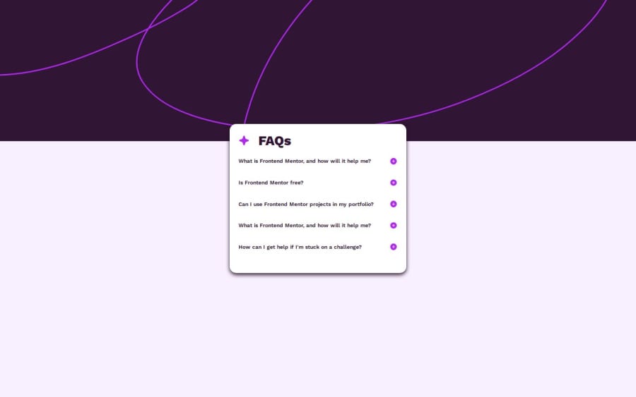
Design comparison
Solution retrospective
most proud of my use of the forEach method and finally understanding its use case. also i figured out how to make the background take a background image and also plain color.. crazy.. something i almost didnt know.. and it feels good
What challenges did you encounter, and how did you overcome them?parameters for the foreach was a lil issue but cheers to figuring it out !
Community feedback
- P@lynx232Posted 6 months ago
"Does the solution include semantic HTML?"
No.
-
<div> classes don't count as semantic html. In the future make use of tags such as <header>, <main>, <footer>, <h1> through <h6> to define different titles in the page(like your did for the FAQ) while also keeping that the numbers refer to a hierarchy(so <h1> should best be used once just once, meanwhile <h2> for exemple should be used multiple times for titles of the same importance);
-
I suggest using <summary>(semantic) for the different titles instead of <div>;
-
Keep in mind that empty classes such as <div> have no meaning to screen readers.
"Is it accessible, and what improvements could be made?"
Not quite. Start attributing classes to your elements(ex: <h1 class=''the name you feel is most fitting'">. Also you can use a naming scheme for subclasses such as <main class=''name of your choice'"> <h1 class=''name of your choice__h1 name of choice'").
"Does the layout look good on a range of screen sizes?" No.
- Make use of media queries for a broader range of screens. For ultrawide make use of background: top repeat-x" so the svg file will stretch along the whole page;
- Adjust the font size, padding etc. to better reflect the reference photos provided in the rar file;
- Switch from pixel units to em/rem, vw/vh units so you'll have an easier time adjusting for different screen sizes.
"Is the code well-structured, readable, and reusable?"
While it is readable and to a certain degree reusable, try to use comments to delimitate different elements of the page in the future(ex: /Paragraphs/).
"Does the solution differ considerably from the design?"
Not by much. Just modify the padding down for the body element in css and increase the size of the card.
Even though you still have a ways to go you should still be applauded for your effort as this is no simple endeavor. My advice is to learn more about html and css in general and to not get fooled by "miraculous" 1h crash courses which promise you to teach you everything there is to know. Make constant effort to improve, don't chase shortcuts and you will surely master web development.
Best of luck on your journey!
Marked as helpful0 -
- @tushar-RuhelaPosted 6 months ago
yes, solution include semantic HTML yes ,it is accessible, and no improvements would made yes ,the layout look good on a range of screen sizes yes, code well-structured, readable, and reusable No the solution is not considerably differ from the design
0
Please log in to post a comment
Log in with GitHubJoin our Discord community
Join thousands of Frontend Mentor community members taking the challenges, sharing resources, helping each other, and chatting about all things front-end!
Join our Discord
