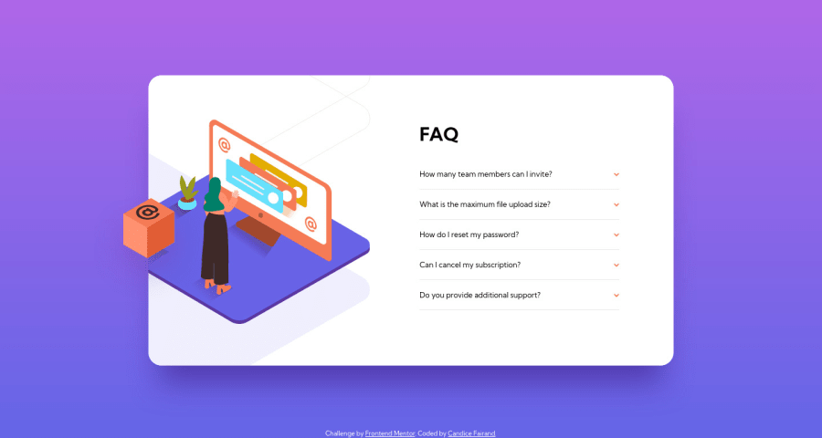
Responsive FAQ component using Flexbox and relative positioning
Design comparison
Solution retrospective
I really struggled with the positioning of the images for the desktop layout, and finally understood that I had to put them in divs to position them more easily.
Also, I couldn't find a way to close all the other answers when one question is clicked AND still be able to close the opened answer by clicking again on the question. Does anyone have an idea of the way it should be implemented? Thanks!
Community feedback
- @isprutfromuaPosted over 2 years ago
Hi there. You did a good job 😎
keep improving your programming skills🛠️
your solution looks great, however, if you want to improve it, you can follow these recommendation:
**HTML**
✅ Avoid complex wrapping. For better performance please tried to avoid unnecessary wrapping. It will create unnecessary node in your HTML tree and reduce performance too.
<div class="desktop"> <div class="desktop-shadow"> <img src="images/bg-pattern-desktop.svg" alt="Main icon shadow"> </div> <div class="desktop-icon"> <img src="images/illustration-woman-online-desktop.svg" alt="Main icon"> </div> </div>
✅ Follow a consistent HTML format. It is important to remain consistent in your HTML style. You can use prettier to help you with that but the goal is to always follow a consistent way you code your markup.
<article class="accordion-question"> <h2 class="question">How many team members can I invite?</h2> <div class="panel"> <p class="panel-text">You can invite up to 2 additional users on the Free plan. There is no limit on team members for the Premium plan.</p> </div> </article>
✅ Prefer picture over images where it applies. This allows you to load smaller size images for mobile devices faster and bigger images for desktop.
<picture> <source srcset="image-desktop.jpg" media="(min-width: 800px)"> <img src="image-mobile.png" alt="picture"/> </picture>
**CSS**
✅ Write consistent CSS. At the beginning part of the project you can set some rules for maintain throughout to your entire stylesheet. If you follow the convention or BEM, you’ll be able to write CSS without being afraid of side effects.
.max-width-wrapper { max-width: 327px; margin: 0 auto; } main { background-color: hsl(0deg, 0%, 100%); border-radius: 23px; ....... p { font-size: 12px; line-height: 18px; }
✅ Use rem’s or em’s. Using rem’s or em’s is more dynamic way instead of using pixels. Try to use rem’s or em’s rather than pixels.
.mobile-icon { margin-top: -240px; margin-bottom: 60px; width: 237px; height: 180px; }
✅ Use mobile first development approach. A mobile-first approach to styling means that styles are applied first to mobile devices.
✅ Use Shorthand . For multiple elements like padding, margin, font, and some others, you can combine styles in one line.
.accordion { padding-left: 0; padding-right: 0; }
✅ Avoid Extra Selectors. Adding extra selectors won't bring Armageddon or anything of the sort, but they do keep your CSS from being as simple and clean as possible.
.panel-text .open { display: block; }
✅ Use Clamp . The clamp function make smaller and simple CSS to control element width.
width: clamp(100px, 50%, 300px); this means: 100px min width, 50% - recommended, 300px - max width
✅ Use CSS Variables . Making the code flexible is equally important so that refactoring won’t be a problem for you. One of the best ways to achieve this is variables.
**js**
✅ Use Template Literals . Template literals are created using the backtick character (`), and they offer many advantages. You can put expressions inside them or create multi-line strings.
panel.style.maxHeight = `${panel.scrollHeight}px`;
✅ Reduce Global Variables . You significantly reduce the chance of bad interactions with other applications, widgets, or libraries.
✅ Use Arrow Functions . They make the functional elements of JavaScript more appealing to the eye and easier to write.
question[i].addEventListener("click", () => {
I hope my feedback will be helpful. You can mark it as useful if so 👍 it is not difficult for you, but I understand that my efforts have been appreciated
Good luck and fun coding 🤝⌨️
Marked as helpful0@CandyfairPosted over 2 years ago@isprutfromua Hi Ivan, and thank you so much for your feedback, your comments are pure gold! It will help me a lot to improve that challenge and start the next ones with solid foundations 👍
0@isprutfromuaPosted over 2 years ago@Candyfair I'm glad that my comment was helpful to you.
Contact me if you have any questions
Cheers
0
Please log in to post a comment
Log in with GitHubJoin our Discord community
Join thousands of Frontend Mentor community members taking the challenges, sharing resources, helping each other, and chatting about all things front-end!
Join our Discord