Not Found
Not Found
Not Found
Not Found
Not Found
Not Found
Not Found
Not Found
Not Found
Not Found
Not Found
Not Found
Not Found
Not Found
Not Found
Not Found
Not Found
Not Found
Not Found
Not Found

Submitted

Responsive FAQ Card - Flexbox, CSS Grid, SASS, JS
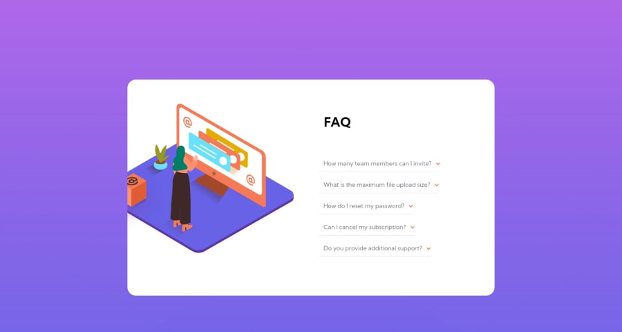
Bel Sahnβ€’ 440

@BelumS

Desktop design screenshot for the FAQ accordion card coding challenge

This is a solution for...

  • HTML
  • CSS
  • JS
1newbie
View challenge

Design comparison


SolutionDesign

Solution retrospective


Hello everyone, I'm really looking forward to this one, as I struggled quite a bit with positioning and alignment.

  1. How did you get the arrows to align perfectly to the right of the text? I used justify-content: flex-end; to no avail.

  2. Were you able to perform it with just CSS, if so, how?

  3. If you used JS, how'd you get the styles to remain stable during the animations?

  4. How did you align the main image for mobile and desktop? For the desktop style, how'd you get the box image to position off the side of the card, while the main image was overflowed?

  5. How'd you style the after effect of the image with the darkened color? I attempted to use ::after, and that failed.

Any help is appreciated, thanks!

Community feedback

Vanza Setiaβ€’ 27,795

@vanzasetia

Posted

Hi, Bel Sahn! πŸ‘‹

Good effort on this challenge! πŸ‘

Regarding your questions:

  • I used flexbox to create a whitespace between the text and the arrow icon. By looking at your HTML, why there are two img elements for the icon-arrow-down.svg?
  • For the second question, what is "it" that you mean?
  • Sorry, I don't understand what you mean. Could you explain your question more? Like, what animations and elements that you are talking about?
  • On mobile, I used the img element and absolute positioning to position illustration-woman-online-mobile.svg. On the desktop, I made the illustration-woman as a background image while making the box image as img element.
  • Are you talking about the illustration-box-desktop.svg? It's already have the black box shadow by default.

I have some recommendations.

  • I would not recommend using aside element to wrap the accordion. The accordions are the main content of the page (not complementary content).
  • It's best to add click events only to interactive elements. This way, the interactive elements can be accessed by the keyboard and screenreaders. If you add click events to non-interactive elements then users of assistive technology would not know that they have interactivity.
  • I recommend using the native HTML elements for the accordion elements, summary and details. Those elements are accessible by default.
  • If you follow my previous suggestion, then for the JavaScript, I recommend creating a function that only allows the users to open one accordion panel at a time.
  • Avoid using JavaScript to add styling (unless you've no other option). JavaScript allows you to change the CSS code using the style property. But, to make debugging easier and improve code maintainability, it’s best to avoid it. Use CSS classes intead.

Hope this helps. πŸ™‚

P.S. You can visit my solution to learn more about my solution. It can be your reference or help you understand some of my answers to your questions.

Marked as helpful

1

Please log in to post a comment

Log in with GitHub
Discord logo

Join our Discord community

Join thousands of Frontend Mentor community members taking the challenges, sharing resources, helping each other, and chatting about all things front-end!

Join our Discord