


Hi, I hope this feedback is helpful
- Header is a very important landmark. It cannot be included and then have no content inside! It needs to be removed
- It's not recommended to add empty divs to html purely for styling reasons. If the image is changing between screen sizes it would be much better to use the picture element for good performance. If the image never changes then background image is OK
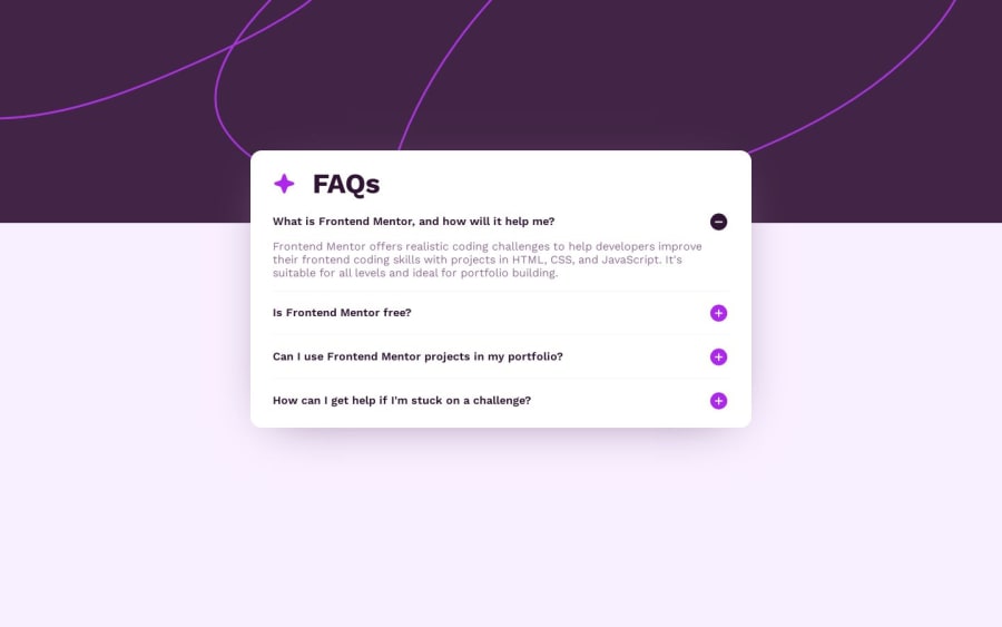
- The star image is decorative so should have empty alt. So is the plus you have incorrectly labelled as "icon"
- Headings must be in order. This is extremely important for accessibility and SEO. You cannot jump from a h1 to h4
- It is essential to use the correct elements for interactivity. Heading elements are not clickable so this is inaccessible. Accordions like this are called "disclosures" — Read this to find out what you need
- It is more performant to link the fonts in the html head instead of css imports
- Css should always start with a modern css reset at the start of the styles in every project
- Font size must never ever be in px
- Max width on the component should be in rem not px. You will want to have control of its max width and shouldn't need to change this at different screen sizes. With % you have no control and are forced to change max widths often.
- It is very confusing naming classes the same as established html landmarks when they are used elsewhere. At least use something like "faq-header" instead of just "header" so it's less confusing reading the css
- Use padding on the component not max width in %
- Media queries must be defined in rem or em for responsive sites. You only need one media query in this challenge. Once the above is fixed you should be able to delete others.
- Once the html is fixed you will need to change the js a little as it will need to toggle aria- state. You will be able to do most of what you are doing now all in the css instead of js.
Marked as helpful
0
Binyam• 400
@binzam
Posted
@grace-snow Thank you for the feedback, It is very helpful!
0
