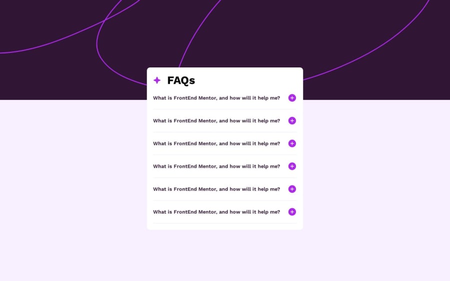
Design comparison
Solution retrospective
Question: I was having trouble figuring out the best approach to responsive design and would appreciate any feedback. The challenge has 2 designs: one for mobile (375px), and another for desktop (1440px). Do you create multiple media queries between these resolutions? If so, can you breakdown your thought process on making sure the responsive design flows well?
I greatly appreciate any feedback.
Thank you!
Community feedback
- @nabinkatwal7Posted 10 months ago
You can implement mobile design by simply adding breakpoints at require width or heights. Here is an example:
/* Mobile devices */ @media only screen and (max-width: 767px) { /* Styles for mobile devices */ } /* Tablets and small laptops */ @media only screen and (min-width: 768px) and (max-width: 1023px) { /* Styles for tablets and small laptops */ } /* Laptops and desktops */ @media only screen and (min-width: 1024px) { /* Styles for laptops and desktops */ }0@raistmerePosted 10 months ago@nabinkatwal7
Thank you for your feedback. I wasn't sure where I should put them but your template you provided will help me for future challenges.
I appreciate it
0 - @RazaAbbas62Posted 10 months ago
Implementing distinct media queries for mobile (375px) and desktop (1440px) is essential to ensure a seamless responsive design that prioritizes content hierarchy and functionality adjustments. Thanks
0
Please log in to post a comment
Log in with GitHubJoin our Discord community
Join thousands of Frontend Mentor community members taking the challenges, sharing resources, helping each other, and chatting about all things front-end!
Join our Discord
