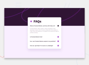
Responsive FAQ Accordion using HTML CSS & JS
Design comparison
Solution retrospective
-Do you have any suggestions regarding best practices, especially in terms of HTML, CSS, and JavaScript organization? -How well does the accordion adapt to different screen sizes? -Were you able to easily navigate and interact with the FAQ accordion? -Did you find any issues with the hide/show functionality or keyboard navigation?
Community feedback
- @Ezekiel225Posted 9 months ago
Hello there 👋 @Sezalsaundarya11.
Good job on completing the challenge !
Your project looks really good!
I have a suggestion about your code that might interest you.
There is an very useful browser extension called Perfect Pixel that allow you compare with the design image and thus see the exact dimensions. I recommend it to you.
I hope this suggestion is useful for future projects.
Keep up the excellent work and continue to challenge yourself with new projects. Your progress is impressive, and each project is a step forward in your front-end development journey! 🚀🌟.
Other than that, great job!
Happy coding.
Marked as helpful1 - @danielmrz-devPosted 9 months ago
Hello @Sezalsaundarya11!
Your project looks really good!
I just have one suggestion:
- You don't need a separate container to create that background pattern. You can use both
background-colorandbackground-imagetogether on the body. They will not cancel each other.
I hope it helps!
Other than that, great job!
0 - You don't need a separate container to create that background pattern. You can use both
Please log in to post a comment
Log in with GitHubJoin our Discord community
Join thousands of Frontend Mentor community members taking the challenges, sharing resources, helping each other, and chatting about all things front-end!
Join our Discord
