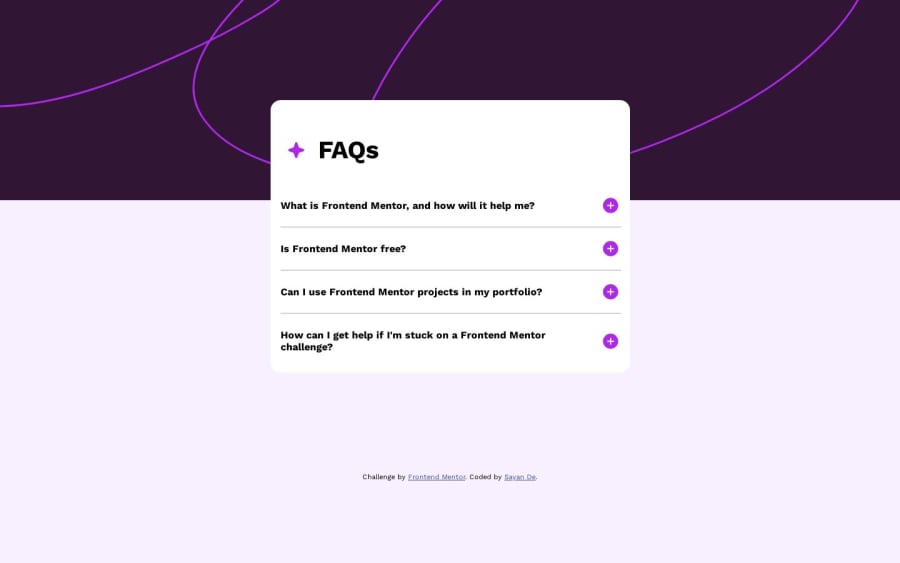
Design comparison
SolutionDesign
Solution retrospective
- Any specific things you liked
- Anything you did not like
- Anything you would have liked to see
- Any articles or resources that might be useful
- Would love to connect, so let me know
Community feedback
- @yozidstPosted 11 months ago
- I liked that your accordion stays in place and doesn't scale up and cut part of the top. Also, it's mobile-friendly.
- Your panel div should be included inside your accordion div; that way the answers wouldn't stretch past or you can set smaller widths on the container.
- Maybe some animations of the sort &
pointer: cursoron the accordion/ questions
~ Those aside, Great Work! Keep it up!
Marked as helpful0
Please log in to post a comment
Log in with GitHubJoin our Discord community
Join thousands of Frontend Mentor community members taking the challenges, sharing resources, helping each other, and chatting about all things front-end!
Join our Discord
