Responsive FAQ Accordion page with HTML, CSS and JS
Design comparison
Solution retrospective
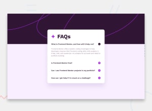
I had some difficulty making the site responsive even when the questions are open, as the main (.card) grows upwards. I appreciate any feedback, thank you!
Community feedback
- @CarlHummPosted 10 months ago
Hi there!
The reason why your content grows upwards instead of down is because of
transform: translate(-50%, -50%)andleft: 50%; top: 50%.As you know this command will center your content perfectly on both the horizontal and vertical axis, and it will do this relative to the space available using percentages.
When you click questions and
.answersgets givendisplay: flexyour.cardhas more content, and so the height grows. In-order to preserve the current alignment and keep the box center, instead of growing downwards the content grows middle out to ensure even margins top and bottom.Solution?
Well there are plenty of different ways you could center your content. You don't need to use position: absolute, or transform: translate. For instance, you could:
- Method 1 : Align the box to the center using
margin-left: autoandmargin-right: autoand then apply a negative margin-top for overlap. - Method 2 : Nest
.cardwithin<main>and make it a flex container withjustify-content: center, then position the.cardto overlap using margin, top or translateY. - Method 3 : Similar to before, but use grid and overlap by spanning rows.
Hope this helps, and good luck on your next project/challenge!
Marked as helpful1@bulhoesgabrielPosted 10 months agoThank you so much! Those tips gonna help me for sure. @CarlHumm
1 - Method 1 : Align the box to the center using
Please log in to post a comment
Log in with GitHubJoin our Discord community
Join thousands of Frontend Mentor community members taking the challenges, sharing resources, helping each other, and chatting about all things front-end!
Join our Discord
