Design comparison
SolutionDesign
Solution retrospective
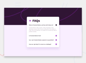
For this challenge I tried to get my design as close to the preview as possible, spending a lot of time tweaking it to match. It didn't end up perfect, but I'm happy with the result nonetheless.
With this being basically my first time with JS, I wasn't able to write the code myself, but instead relied on snippets from w3schools & copilot to assist. Going forward I want to rely on these sources less, and my own coding abilities more.
I'm sure this can be done a lot better, so any feedback is welcome and appreciated. Thanks!
Community feedback
Please log in to post a comment
Log in with GitHubJoin our Discord community
Join thousands of Frontend Mentor community members taking the challenges, sharing resources, helping each other, and chatting about all things front-end!
Join our Discord
