

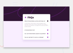
Design comparison
SolutionDesign

Solution retrospective
Adding the plus and minus svg was difficult until i saw a site that converts svg to URL
Community feedback
- @ratul0407Posted 12 months ago
@khalid225 congrats on completing this solution🎉🎉
You've tried really well. But you can make it better.
- the body element get's some default styling which is implemented differently by different browsers. You should always get rid of them first and then start your own styling. And for that you can use some css resets. Because of those default styling of the
bodythecontainer-bodyhas shrunk a little bit and to fix that just do this
body { margin: 0; padding: 0; }- Also remove
.accordion-body { width: 80%}andimg { width: 100% /* by default it's always 100%*/}. And on the accordion remove the width of 50% and apply this.
/* for mobile screens */ .accordion { max-width: 45rem; margin: 1rem; } /* for desktop */ @media(min-width: 45em) { .accordion { margin: auto; } }- I'd recommend you to use rems instead of pixels. And if you want to know why Here's an article deep diving into this topic. Stop Using Pixels!
I hope you found this helpful👍👍
Keep up the good work and have a very nice day🙂😄
Marked as helpful0@khalid225Posted 12 months ago@ratul0407 Thank you for pointing these out they are really helpful
0 - the body element get's some default styling which is implemented differently by different browsers. You should always get rid of them first and then start your own styling. And for that you can use some css resets. Because of those default styling of the

Please log in to post a comment
Log in with GitHub
Join our Discord community
Join thousands of Frontend Mentor community members taking the challenges, sharing resources, helping each other, and chatting about all things front-end!
Join our Discord