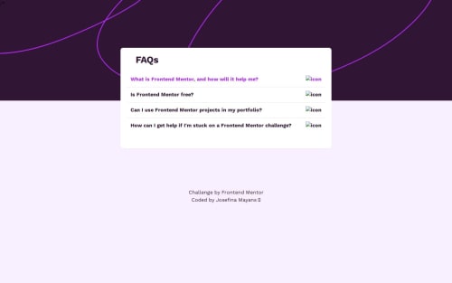
Responsive FAQ Accordion component using React and Tailwind CSS

Solution retrospective
Handling the mobile first approach by using Tailwind CSS in a smart way is something I am proud of. Also, the use of clean React components.
Next time, I would try some testing libraries just to practice TDD, and also try some other CSS approach like Styled Components or even libraries like Material UI.
What challenges did you encounter, and how did you overcome them?Probably the keyboard navigation was the most challenging since I had never done it, but I managed to overcome it with some help from my dear friend Google XD.
What specific areas of your project would you like help with?When not on a 1440px or 375px screen viewport size, items such as the background header image appear in a strange way. Also, there is some problems with visualizing some icons in the Vercel deployment.
If anyone has any comments, it would be much appreciated!
Please log in to post a comment
Log in with GitHubCommunity feedback
No feedback yet. Be the first to give feedback on Josefina's solution.
Join our Discord community
Join thousands of Frontend Mentor community members taking the challenges, sharing resources, helping each other, and chatting about all things front-end!
Join our Discord