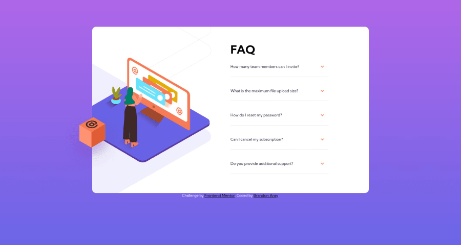
Design comparison
SolutionDesign
Solution retrospective
Any suggestion on how to handle the images on both mobile and desktop, and any improvements I could do to my code? Thank you very much in advance.
Community feedback
- @vanzasetiaPosted almost 3 years ago
š Greetings, Brandon!
š Congratulations on finishing this challenge! I have some feedback on this solution:
- Accessibility
- All the page content should live inside landmark elements (
header
,nav
,main
, andfooter
). By using them correctly, you can make users of assistive technology navigate the website easily. In this case, you already wrap all of it withmain
tag,except the attribution, well done š. One more thing you can do, you can swap thediv
withfooter
for the attribution.
- All the page content should live inside landmark elements (
<body> <main> page content goes here... </main> <footer class="attribution"> attribution links goes here... </footer> </body>
- For any decorative images, each
img
tag should have emptyalt=""
andaria-hidden="true"
attributes to make all web assistive technologies such as screen reader ignore those images. In this case, all images are decorative only. - Currently all the accordion panels are not accessible with keyboard (
Tab
andEnter
). You can usedetails
andsummary
tags to make them easily accessible. - I would recommend using
rem
unit for font size. Usingpx
will not allow the users to control the font size based on their needs. - Styling
- On mobile landscape view (360px * 640px), once the user scroll to see the rest of the content, the background gradient does not fill the entire page. It's becuase you are using
height
property instead ofmin-height
.
- On mobile landscape view (360px * 640px), once the user scroll to see the rest of the content, the background gradient does not fill the entire page. It's becuase you are using
- Best Practice
- Remove the commented code. If another developer (it can be you in the future) wants to improve this solution, he/she might get confused about whether or not the commented code should be used or deleted.
That's it! Hopefully, this is helpful!
Marked as helpful0 - Accessibility
Please log in to post a comment
Log in with GitHubJoin our Discord community
Join thousands of Frontend Mentor community members taking the challenges, sharing resources, helping each other, and chatting about all things front-end!
Join our Discord