

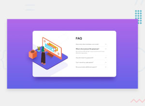
Design comparison

Solution retrospective
My first challenge with JS :]
Community feedback
- @shashreesamuelPosted over 2 years ago
Hey nonamehz, good job completing this challenge. Keep up the good work.
Your solution looks good however the sentence "What is the maximum file upload size" should be in bold.
I hope this helps
Cheers Happy coding 👍
1 - @vanzasetiaPosted over 2 years ago
Hi, Jose! 👋
Congratulations on completing your first JavaScript challenge! 🎉
Some feedback on this solution:
- Accessibility
- Good job on using
mainlandmark! 👍 - Don't use
headerfor the card content since it is not a full webpage. This is one chunk of content that all belong together and in a real website would sit with other content. - Currently the accordion panels are not accessible by keyboard and screen reader. Use the native HTML accordion instead,
detailsandsummary. They are accessible by default. - Create a custom
:focus-visiblestyling to any interactive elements (button, links,input,textarea). This will make the users can navigate this website using keyboard (by usingTabkey) easily. - For any decorative images, each
imgtag should have emptyalt=""andaria-hidden="true"attributes to make all web assistive technologies such as screen reader ignore those images. In this case, all images are decorative only. - There's no need to uppercase the alternative text for images. I'm afraid that the screen reader will spell them letter by letter instead of reading them as a sentence.
- Each question should not be a heading for sure. The content below it is too small. You might find it helpful if you think of a heading like a title on a document.
- Use
remor sometimesemunit instead ofpx. Usingpxwill not allow the users to control the size of the page based on their needs.
- Good job on using
- Styling
- Don't limit the height of the
bodyelement, it will not allow the users to scroll the page if the page content needs moreheight. Usemin-heightinstead. - There's no need to specify
width: 100vwto the.containerelement. By default, the block element would have full width. Also, remove theoverflow: auto;. - I would rather make the
bodyelement as the flex container to center the.containeror the card in the middle of the page. That way, I can remove thesectiontag inside the.containersince it's neither adding meaning nor making the HTML more semantic.
- Don't limit the height of the
1440px for desktop layout is too late. It looks like you are using the value from the
style-guide.mdas your breakpoint. The sizes on thestyle-guide.mdhave nothing to do with the media queries. They are telling you that "this is how your website should look like at these screen sizes". As frontend developers, we should keep making your website looks good in between those screen sizes.That's it! Hope you find this useful! 😁
1 - Accessibility


Please log in to post a comment
Log in with GitHub
Join our Discord community
Join thousands of Frontend Mentor community members taking the challenges, sharing resources, helping each other, and chatting about all things front-end!
Join our Discord