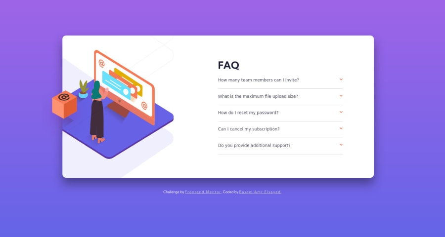
Design comparison
Solution retrospective
I decided to learn something new and get best value from learning it in using it in a challenge. I learned SASS[SASS] and tried to use it as much powerful I could Any feedback on how to improve is very appreciated, thank you.
Community feedback
- @grace-snowPosted almost 3 years ago
This looks broken for me on mobile I’m afraid - I’ll add screenshots to slack so you can see what I’m seeing.
Other really important fixes needed
- headings have to be in order, it’s important not to skip heading levels
- there are no interactive elements on this at the moment. It’s essential for clicks to be handled on button elements in this case. Those are expander buttons and would go a long way to making this accessible to keyboard and screenreader users
- a really common pitfall when people start trying sass is to over nest selectors. I’ve never actually seen a selector this long before
.card .faqs .questions-container .question-box .question, .card .faqs .questions-container .question-box.active-faq-box .answer
! You definitely don’t want that. Sass should output css that is exactly how you would want it if you were writing it from scratch - that means low specificity, single class selectors. A good rule of thumb is to only nest things that directly relate to a class, like pseudo elements (before/after), pseudo states (like hover or focus-visible) and media queries
Good luck with it
Marked as helpful3@BasemAmrPosted almost 3 years ago@grace-snow the problem with mobile view is, Firefox's responsive mode gives me some result, then Chrome's one gives me a different result, and my phone gives me another different results! I tried to make it ok to my phone, but I am going to try again to fix the problem
thank you very much
0 - @grace-snowPosted almost 3 years ago
Much much better 😊
One really important change needed still to the buttons is they need an aria-expanded attribute on them that toggles from false to true. You’ll need this every time in future you use a disclosure pattern like this.
Probably worth adding the type attribute on those buttons too. That’s just general good practice, you wouldn’t believe the number of bugs leaving that out can cause.
Well done again
Marked as helpful0 - @vanzasetiaPosted almost 3 years ago
👋 Hello there!
🎉 Congratulations on finishing this project! Grace has given some incredible feedback, especially about the nesting feature on the Sass. You should definitely follow what she recommended to you.
As a side note, if you nest too much, the other developer ( it might be you in the future) might get confused ( I myself have experienced it 😆) because it's getting harder to find the parent element.
I have some feedback on this solution:
- Accessibility
- Like Grace has mentioned earlier, you don't use interactive elements for the accordion. I would recommend using the
details
andsummary
tags. By default, they are already accessible. - Use
rem
or sometimesem
unit instead ofpx
. Usingpx
will not allow the users to control the size of the page based on their needs.
- Like Grace has mentioned earlier, you don't use interactive elements for the accordion. I would recommend using the
- Visual
- On mobile landscape view (640px * 360px), the illustration image is positioned incorrectly.
- Still on the same view, your attribution is positioned above the card.
That's it! Hopefully, this is helpful!
Marked as helpful0@BasemAmrPosted almost 3 years ago@vanzasetia thank you very much,
yes this happened to me already 😅 I think I did something wrong in layout the main element, I will figure it out and fix it
0 - Accessibility
Please log in to post a comment
Log in with GitHubJoin our Discord community
Join thousands of Frontend Mentor community members taking the challenges, sharing resources, helping each other, and chatting about all things front-end!
Join our Discord