Submitted about 2 years ago
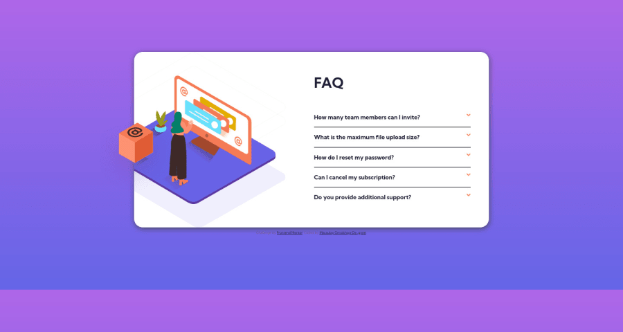
Responsive FAQ Accordion Card (#Html5, CSS, JS, Mobile-first workflow)
@MacChristo
Design comparison
SolutionDesign
Solution retrospective
My second JavaScript challenge. It was quite interesting and the design was simple. I had a few issues with toggling the answers but thanks to a certain pizzaancoding88, I was able to compare our code and find out where I went wrong. Any more ideas to improve my solution are welcome. Thanks.
Community feedback
- @AdrianoEscarabotePosted about 2 years ago
Hi Macaulay Omoikhoje De-great, how are you?
I really liked the result of your project, but I have some tips that I think you will enjoy:
- To align some content in the center of the screen, always prefer to use
display: flex;it will make the layout more responsive!
Example:
body {
    margin: 0;
    padding: 0;
    display: flex;
    align-items: center;
    justify-content: center;
    min-height: 100vh;
}
The rest is great!
I hope it helps... 👍
Marked as helpful0@MacChristoPosted about 2 years ago@AdrianoEscarabote Sure. Thanks a lot. I will do just that.
0 - To align some content in the center of the screen, always prefer to use
Please log in to post a comment
Log in with GitHubJoin our Discord community
Join thousands of Frontend Mentor community members taking the challenges, sharing resources, helping each other, and chatting about all things front-end!
Join our Discord
