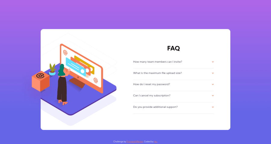
Design comparison
Solution retrospective
First project using a little bit o JS!
Had a hard time figuring out the desktop design when positioning the background and box images together.
Can someone please explain why when zooming in on PC the only thing that actually zooms is the font? How to fix that?
Thanks for the views and possible feedback!!
Community feedback
- @brasspetalsPosted over 3 years ago
Hi, Igu! 👋
I believe the reason only the fonts respond to zoom is that your card min-height and min-width are set with viewport units. Zooming doesn't change the size of the viewport. If you used px or rem units, for example, it should respond to zoom.
1 - @grace-snowPosted over 3 years ago
Hi
You have quite a few issues here I'm afraid. Mainly caused by
- absolute positioning
- viewport units on widths and heights (you wouldn't need widths and heights on content without the absolute positioning
- font sizes in px (should be rem/em)
- js being used to change font size rather than add/remove classes
- background sizes being in percentages
I would do this by
- making the card a flex item, each of the children having 50% flex basis on desktop
- in the left half, have the pattern as bg image, have the woman image in HTML, have the box as a pseudo element attached to the card
- use js to toggle a class to show faq answer
- that class only change opacity + visibility
What you've done really really well is the HTML markup on this. You've used interactive elements so it's easy to use with my keyboard. Well done!
To be honest, all the styling stuff on this challenge is really complex. It's unlikely you'd encounter a design like this. But good practice I guess.
0@igor-mitPosted over 3 years agoIs using absolute positioning a bad practice? I see now how it has a lot of impact on causing trouble...
If the BG sizes aren't in %, will they scale with the screen? What would be the correct m.u in this case?
I don't understand how not to use height and width, but only the size of the content itself
And is it bad for js to change font size? I did it this way cause I don't know how to make the animation on showing the answer, I did it with display none to display block but it didn't animate
Thank you for the compliment on the HTML tough, appreciate it a lot !! :)
0@grace-snowPosted over 3 years ago@igor-mit absolute positioning isn't inherently bad, but should only be used in specific circumstances. It's important to understand what impact that has - absolutely positioned elements are removed from the document flow, it's like they don't have any influence on the position of things around them. You would usually only absolutely position specific things, like pseudo elements or decorative motifs/images.
Again, background images can be in percentage size and that's ok. But in this case, they don't really need to be. They could be set to contain, or cover etc. What they really need in this challenge is for the HTML structure to be different, so they have a half of the card to sit in instead of being a background on the whole card. Sorry, I didn't explain that well before.
Instead of adding widths and heights to things, you can let them be as big or small as they need to be, but set limits using min- or max-width instead.
For example, I would split the card into two parts and do something like this:
@media screen and (min-width: 420px) { .card-content { /* width: 50%; */ /* position: absolute; */ /* right: 50px; */ } } .card-content { /* width: 100%; */ /* display: flex; */ /* flex-direction: column; */ /* align-items: center; */ /* justify-content: center; */ } .card { /* top: 40px; */ justify-content: flex-end; } .wraper-acc { /* width: 85%; */ /* padding: 15px 0 15px 0; */ padding: 15px 1.25rem 15px 0; } .accordion::after { /* right: 0; */ right: -1.25rem; top: 0; } .accordion-text { /* margin-top: 10px; */ }
And the css display property won't animate. But you could create animation by changing opacity and visibility (and font size if you want, as long as it scales up in rem/em and never pixels). Again though, do this by toggling a class on the FAQ wrapper, not by changing inline styles in javascript.
0
Please log in to post a comment
Log in with GitHubJoin our Discord community
Join thousands of Frontend Mentor community members taking the challenges, sharing resources, helping each other, and chatting about all things front-end!
Join our Discord