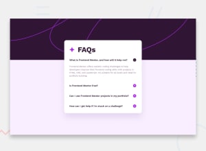
Design comparison
Solution retrospective
Open for any kind of feedbacks :)
Community feedback
- @danielmrz-devPosted 8 months ago
Hello @Jyoti-Bhandari!
Your solution looks great!
I have a suggestion for improvement:
📌 Think about using
<main>to wrap your main content instead of<div>.Imagine
<div>and<span>in HTML as basic containers. They're good for holding stuff, but they don't tell us much about what's inside or its purpose on the webpage.This change might not have impact on how your page looks, but it'll make your HTML code clearer and help with SEO and accessibility.
Hope that's helpful!
Keep up the great work!
Marked as helpful0@Jyoti-BhandariPosted 8 months ago@danielmrz-dev okay sir. I will try to do use main tag more often. Thanks for your feedback :)
1 - @ekinsipahiPosted 8 months ago
absolute positioning would be better here because in lg the card is not partially overflowing the faq section but this is acceptable and good. check out my solution if you want.
0
Please log in to post a comment
Log in with GitHubJoin our Discord community
Join thousands of Frontend Mentor community members taking the challenges, sharing resources, helping each other, and chatting about all things front-end!
Join our Discord
