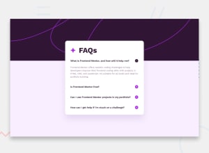
Design comparison
Solution retrospective
I'm proud of getting the white container to grow to fit the content. And getting everything centered on different screen sizes.
What challenges did you encounter, and how did you overcome them?I had two different event listeners for each question, one for the question and one for the plus/minus icon. I didn't realize that I had put the icon inside of my question in the html which was causing everywhere around the question to trigger the event EXCEPT for the plus/minus icon. Since the whole question in my html already included the icon, I just took out the event listeners for the icon and that fixed it.
Another challenge was getting the accordion to center on top of two background images and to expand with the content. My solution was this
    height: fit-content;
    position: absolute;
    inset: 0;
    margin-top: clamp(3%, 8%, 10%);
    margin-bottom: clamp(5%, 10%, 15%);
    overflow: auto;
    margin-inline: auto;
and to be honest I'm not really sure which part of this specifically caused it to be center but it worked.
What specific areas of your project would you like help with?I will happily accept any feedback or advice on anything. Accessibility, ways to do things more efficiently, or anything else.
Community feedback
Please log in to post a comment
Log in with GitHubJoin our Discord community
Join thousands of Frontend Mentor community members taking the challenges, sharing resources, helping each other, and chatting about all things front-end!
Join our Discord
