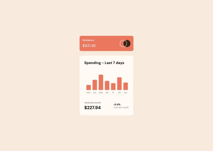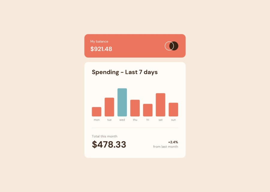
Design comparison
Solution retrospective
Created this Responsive expense tracker component using React and Chart JS library
Please review and give me a feedback on things that I need to improve
Community feedback
- @AdrianoEscarabotePosted over 2 years ago
Hi Lokesh, how are you?
I really liked the result of your project, but I have some tips that I think you will enjoy:
To center your component prefer to do this:
body {
    display: flex;
    align-items: center;
    justify-content: center;
    min height: 100vh;
}
Document should have one main landmark, to solve this accessibility problem, wrap all the content with the main tag. Taking into account that this challenge is based on only one component, we can do that, since it has only one component, but in bigger challenges, pay attention to the use of the main tag!
The rest is great!
I hope it helps... 👍
0@Lokesh8055Posted over 2 years ago@AdrianoEscarabote
Hi Adrain thanks for your suggestions1
Please log in to post a comment
Log in with GitHubJoin our Discord community
Join thousands of Frontend Mentor community members taking the challenges, sharing resources, helping each other, and chatting about all things front-end!
Join our Discord
