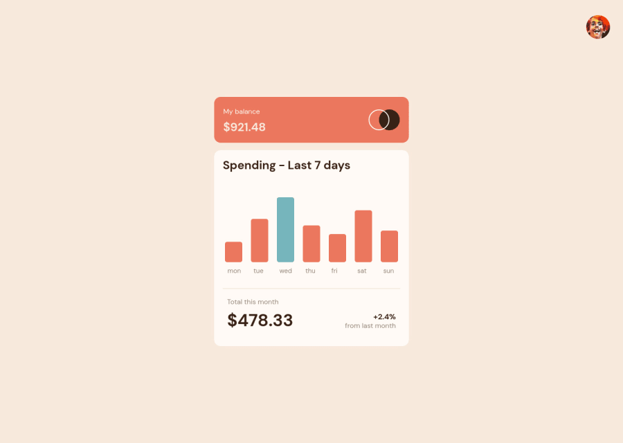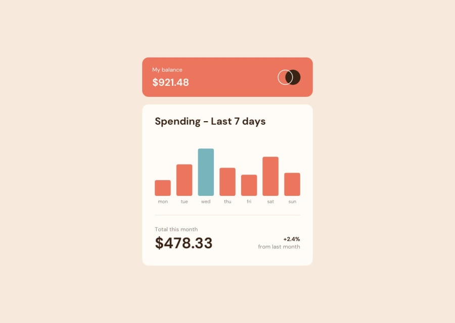
Responsive Expenses-Chart-Component made with HTML and CSS
Design comparison
Solution retrospective
Hello guys am back with a new solution that I made. It took me a while because of the use of the long BEM class names which made my code harder to debug, maybe am bad at using bem. I used sass mixins and functions on this project to make my code reusable and I also used the CSS clamp function which I have become addicted to for now. Well I was not able to add any JavaScript maybe another project. Please feel free to show your opinion on this solution and let me know about Its responsiveness and accessibility.
Community feedback
- @charlesmiller0412Posted over 2 years ago
Hey @Kamasah-Dickson!
I checked out how you were using BEM and have a suggestion. I find it's easier to separate the elements within by alternating between dashes or underscores.
What you had:
card__header__left__balanceWhat I would have:
card__header--left-balanceI'll include a link to the BEM page explaining its use. I hope this is helpful! https://getbem.com/naming/
Great job on the solution though! Fully responsive!
Marked as helpful0@Kamasah-DicksonPosted over 2 years ago@charlesmiller0412 Thank you for your help
0
Please log in to post a comment
Log in with GitHubJoin our Discord community
Join thousands of Frontend Mentor community members taking the challenges, sharing resources, helping each other, and chatting about all things front-end!
Join our Discord
