Submitted over 2 years ago
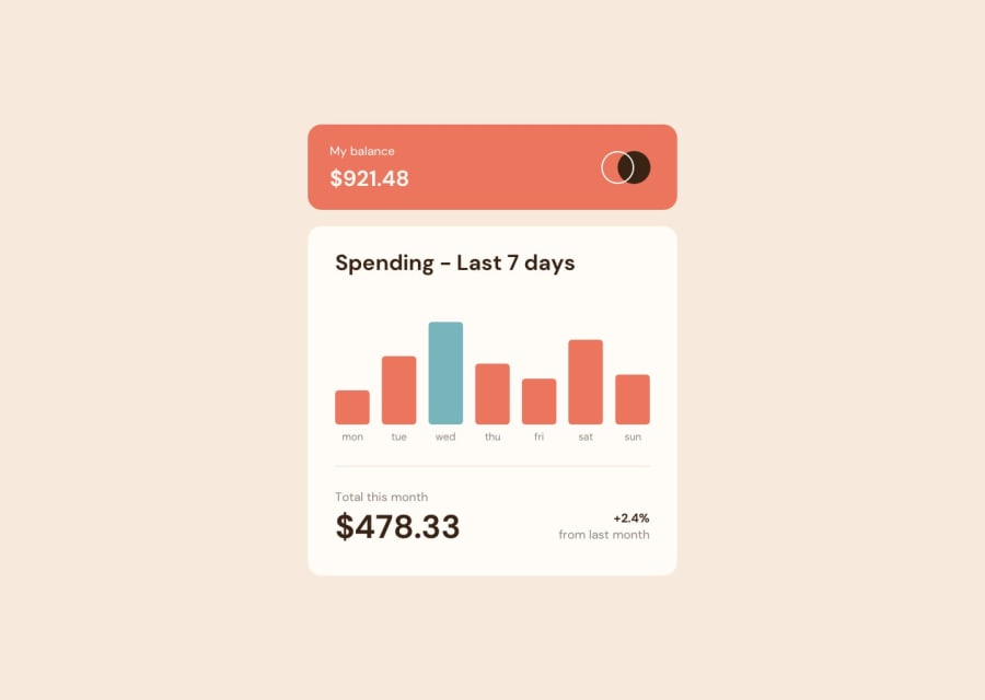
Responsive Expenses Chart Component Solution using HTML, CSS and JS
@Damola-147
Design comparison
SolutionDesign
Solution retrospective
I had a difficult time making this project responsive. I'd appreciate feedbacks on how responsive my solution is and how I could make it better. Thank you!
Community feedback
- @winprnPosted over 2 years ago
Hi, your design looks really cool. However, here are some things that you can improve:
- Use the font family provided in the
style-guide.md. It will make your design looks a lot better. - Your columns on mobile devices seem a little bit too long and thin. The amount gets under the columns next to it, so maybe you will need some
z-indexto display it properly.
Marked as helpful0@Damola-147Posted over 2 years ago@winprn That sounds great. Thanks a lot for the feedback. I appreciate it.
0 - Use the font family provided in the
Please log in to post a comment
Log in with GitHubJoin our Discord community
Join thousands of Frontend Mentor community members taking the challenges, sharing resources, helping each other, and chatting about all things front-end!
Join our Discord
