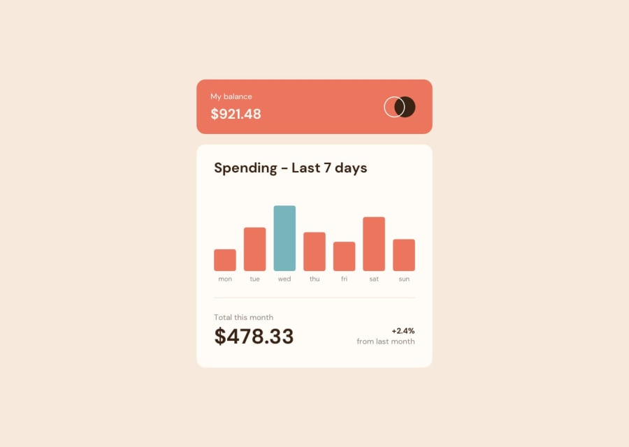
Design comparison
SolutionDesign
Community feedback
- @Illyaas4ShowPosted over 2 years ago
Hi sandrex, good solution you have here. Well done!
- You should add
margin-bottom: 1rem;to the top card instead of using position absolute. - You should use flex-box to center the container as it is a lot easier and works a lot better. Like this
body { display: flex; justify-content: center; align-items: center; min-height: 100vh; }-
You have forgotten the line after the graph. You could add a border-top to the bottom section of the card to look like a horizontal like.
-
Document should have one main landmark- Your page should have one and only one<main>tag to help screen readers navigate the page.You can wrap the whole card in a main tag.
Hope this helped! Happy coding!
Marked as helpful1 - You should add
Please log in to post a comment
Log in with GitHubJoin our Discord community
Join thousands of Frontend Mentor community members taking the challenges, sharing resources, helping each other, and chatting about all things front-end!
Join our Discord
