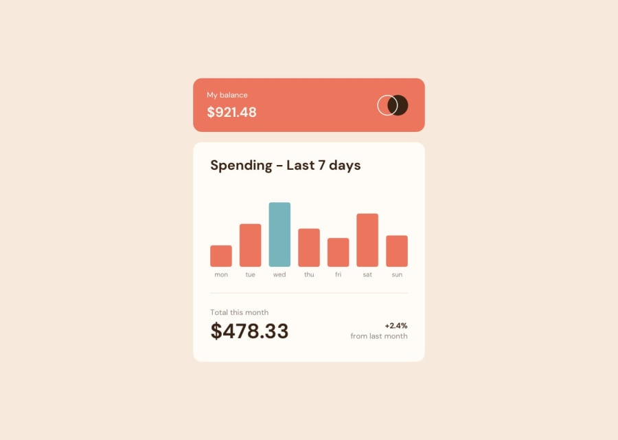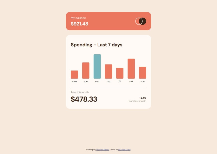
Design comparison
Solution retrospective
Struggled a little bit with the Javascript because Flexbox keeps doing weird things to the bars.. thankfully it went out ok. Just needed to ensure that the heights are not conflicting with each other, and content is loaded first before script is run.
Community feedback
- @petritnurediniPosted 10 months ago
Congratulations on completing your Expenses Chart Component project! It's great to see you putting your web development skills into practice. Here are a few suggestions to enhance your project:
-
Improving Accessibility:
- Consider adding
aria-label
attributes to your interactive elements, like the.day-bar
divs, for better accessibility. These labels help screen reader users understand the purpose of each element. Explore more about ARIA labels on MDN Web Docs.
- Consider adding
-
CSS Best Practices:
- You've done a great job with your CSS, especially with the responsive design. To further improve, consider using CSS variables for frequently used values like colors, border-radius, etc. This makes your CSS more maintainable and easier to update. Check out CSS Variables for more information.
-
JavaScript Code Optimization:
- In your JavaScript file, you could optimize the code by using more descriptive variable names. For example,
maxAmt
could be renamed tomaxAmount
for better readability. Clear and descriptive names make your code easier to understand and maintain. Learn more about JavaScript best practices on JavaScript Info.
- In your JavaScript file, you could optimize the code by using more descriptive variable names. For example,
Keep up the excellent work! Remember that each project you build is a step forward in your journey as a developer. Your progress is commendable and I encourage you to keep experimenting and tackling new challenges. The sky's the limit! ๐๐
Marked as helpful1@salmonkarpPosted 10 months ago@petritnuredini thanks for the feedback, i'm aware i'm often lazy with variable names and accessibility features, i'll make sure to implement them more often in my next challenge.
0 -
- @Ezekiel225Posted 10 months ago
Hello there ๐ @salmonkarp.
Good job on completing the challenge !
Your project looks really good!
I have a suggestion about your code that might interest you.
There is an very useful browser extension called Perfect Pixel that allow you compare with the design image and thus see the exact dimensions. I recommend it to you.
Consider adding a min-height of 100vh to the body element so as to centralize your project.
body { min-height: 100vh; align-items: center; display: flex; justify-content: center; }
I hope this suggestion is useful for future projects.
Other than that, great job!
Happy coding.
Marked as helpful1@salmonkarpPosted 10 months ago@Ezekiel225 thanks for the feedback, the extension is actually really helpful.
0
Please log in to post a comment
Log in with GitHubJoin our Discord community
Join thousands of Frontend Mentor community members taking the challenges, sharing resources, helping each other, and chatting about all things front-end!
Join our Discord