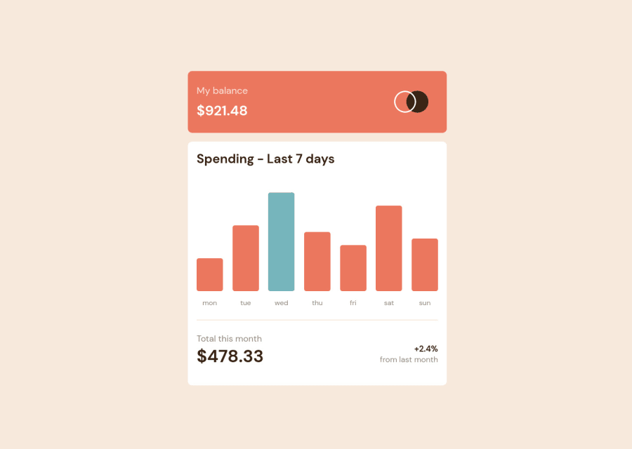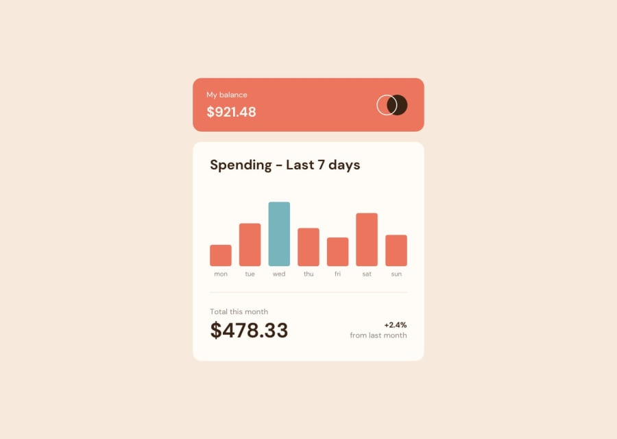
Responsive Expense Chart component using html, CSS and JavaScript.
Design comparison
Solution retrospective
What changes should I make in my codes for best practices?
Community feedback
- Account deleted
Hello Kapil, good work here, I just would like to suggest the following regarding the JS logic. Manipulating the DOM using the property
stylewhile it works generates inline styles for the HTML elements. Instead is a best practice to modify the styles adding or removing classes from the element. Tania Rascia goes deep in the topic. So instead of thisthursdayChart.addEventListener('mouseover', () => { thuData.style.display = "block"; }); thursdayChart.addEventListener('mouseout', () => { thuData.style.display = "none"; });Apply this:
thursdayChart.addEventListener('mouseover',  () => {
    thuData.classList.add("example-class");
});
thursdayChart.addEventListener('mouseout',  () => {
    thuData.classList.remove("example-class");
});
In your CSS that class would look like this.
.example-class { display: block; }Other than tat I like how you styled the component and it seems fairly reponsive so congrats. Happy coding and see you around!
Marked as helpful0@Kapil101527Posted over 2 years ago@alexcumplido Thanks for your suggestions. Really appreciate it.
1
Please log in to post a comment
Log in with GitHubJoin our Discord community
Join thousands of Frontend Mentor community members taking the challenges, sharing resources, helping each other, and chatting about all things front-end!
Join our Discord
