Submitted 12 months ago
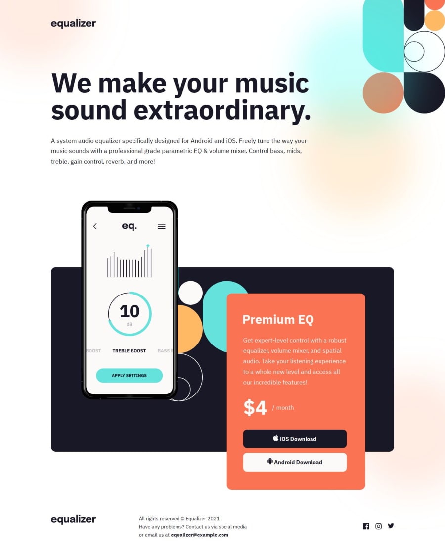
Responsive equalizer landing page using CSS3
#vite
@justinconnell
Design comparison
SolutionDesign
Solution retrospective
I am sticking with Vanilla CSS and JS for now. This project was challenging in terms of getting the layouts right for each device. I made extensive use of CSS Grid for the layouts and used Flexbox to handle the simpler one dimensional layout and positioning of elements.
I also used Vite to manage my development workflow and will continue using Vite for future projects.
Any suggestions to improve the code are welcome!
Community feedback
Please log in to post a comment
Log in with GitHubJoin our Discord community
Join thousands of Frontend Mentor community members taking the challenges, sharing resources, helping each other, and chatting about all things front-end!
Join our Discord
