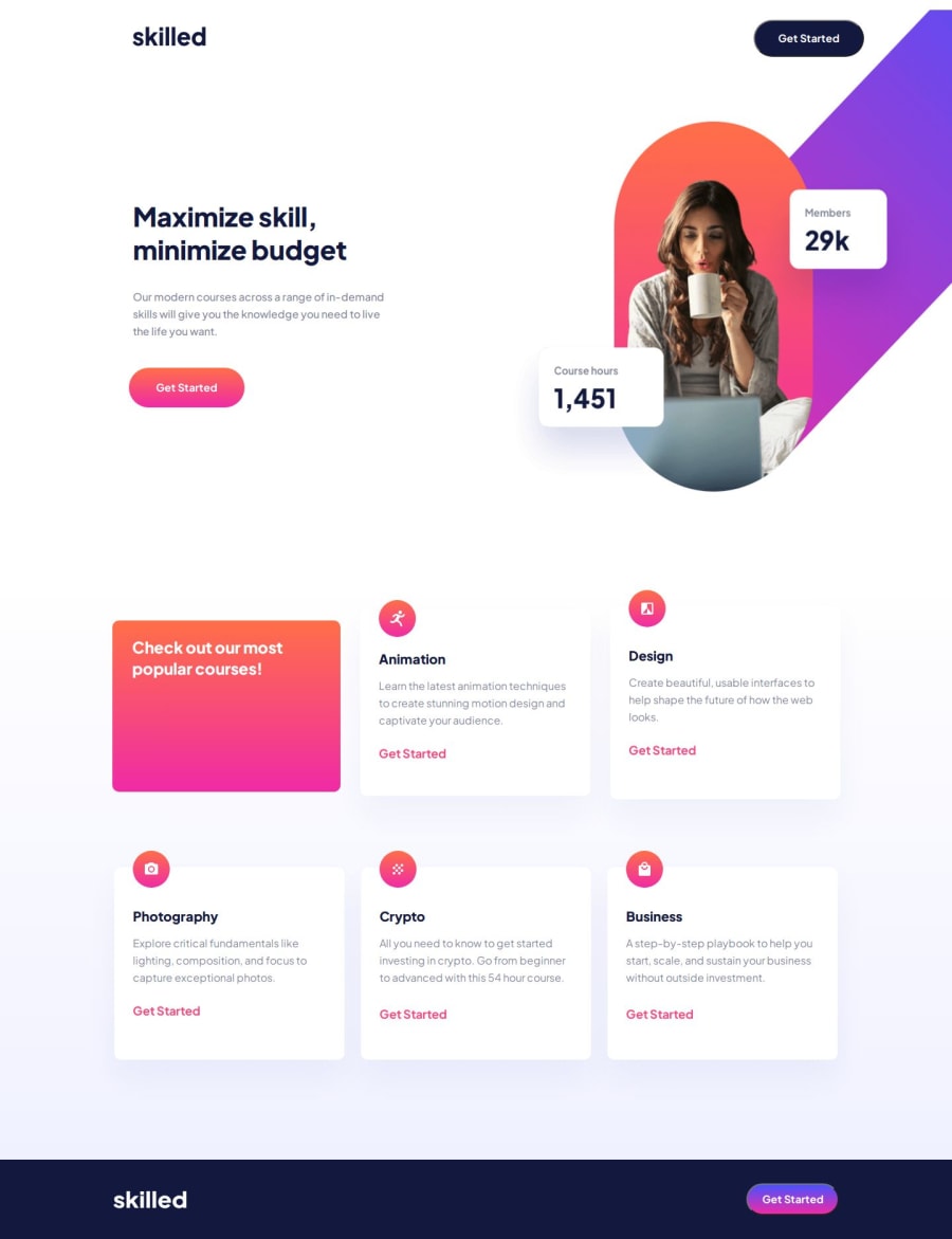
Design comparison
Solution retrospective
This was a great project for furthering my understanding of CSS. It forced me to hone my understanding of Flexbox, the "position" property, and z-index.
What challenges did you encounter, and how did you overcome them?The biggest challenges on this project all dealt with CSS details in the code. I had a button that was not accessible because although visible, the z-index was not set, it was hidden behind the div of a nearby image. This was the first time I had encountered this issue. After completing some research I quickly discovered how to solve the issue.
What specific areas of your project would you like help with?I have two issues that I don't understand:
-
Why is there a scroll bar visible at the bottom of the page when looking at the desktop version of the site? I have set the width and height according to the specifications on the Figma design docs. I'm sure it's a mistake in my CSS but I don't know how to solve it.
-
Why is there so much space between my top section, which holds the "hero-image" at the top of the page, and the bottom section of the page? Again, I've set the height and width of the page according to the design docs but it still seems as though I can't get the spacing just right.
Community feedback
- @Michael-mikeojjPosted 11 months ago
You did really well but the test could be a little bigger
0
Please log in to post a comment
Log in with GitHubJoin our Discord community
Join thousands of Frontend Mentor community members taking the challenges, sharing resources, helping each other, and chatting about all things front-end!
Join our Discord
