Submitted over 2 years ago
Responsive E-Learning Landing Page using Generic HTML/CSS, BEM Naming
#accessibility#bem

@dtp27

Design comparison
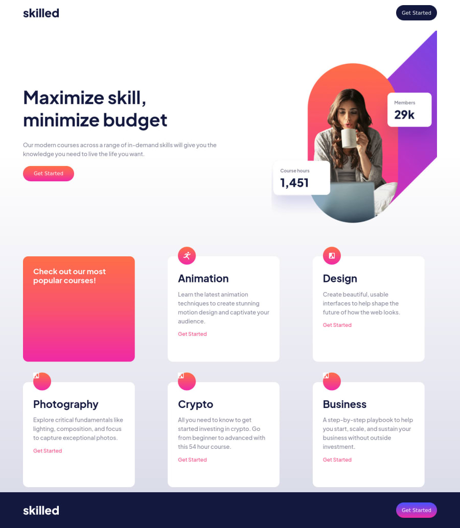
SolutionDesign

Solution retrospective
I would love people to take a hard look at my code and give me as much feedback as possible. :) This one gave me some trouble, and I tried a few things for the first time. Particular items I would especially love feedback on are:
- My usage of the BEM naming system
- My attempt at making my HTML more accessible
- How I can improve the responsiveness and overall style of the hero images. I initially used HTML image elements but switched to background images in CSS since I couldn't get the HTML elements version to work.
- The overall responsiveness of the page. I used the Chrome developer tools to design it using mobile, tablet and desktop views, but it looks awkward when resizing the page between those points. Also, I don't like how the hero image is also re-sizing within the div; I feel like it should be one size, then at the breakpoint change to the next hero image.
- I never got the shading on the gradient to work properly.
- The way I used CSS variables for colors and font styling. This is the first time I actually used Figma so I used the actual pixel sizes instead of having a base size and using rems to size different elements.
Any and all feedback is welcome, including for anything I didn't mention. Thanks!
Community feedback
Please log in to post a comment
Log in with GitHub
Join our Discord community
Join thousands of Frontend Mentor community members taking the challenges, sharing resources, helping each other, and chatting about all things front-end!
Join our Discord