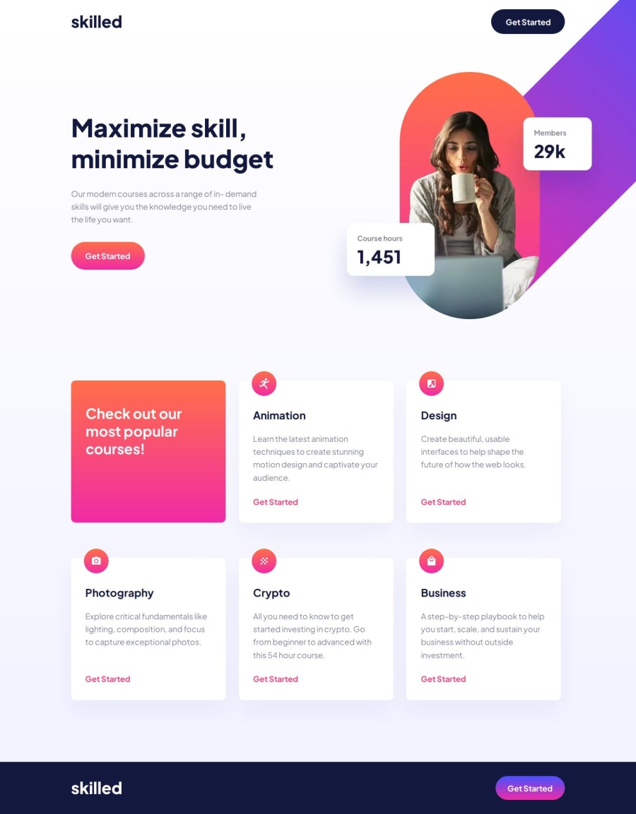
Responsive E-learning landing page using Css and Html
Design comparison
Solution retrospective
I am proud of how simple the project felt. It was meant as my final test before moving up to the junior level.
What challenges did you encounter, and how did you overcome them?Still trying to match the Figma file as closely as possible. I don't know if this is necessary, but my brain sure feels like it is, and I enjoy it. That said, I was a tad flustered by the Figma file dimensions and font weights not matching up visually. As usual, I used my knowledge and resources to match it as closely as possible. In the process, I found some errors in my code that led to some, but not all, of the visual discrepancies.
Community feedback
- @0xabdulkhaliqPosted 12 months ago
Hello there 👋. Congratulations on successfully completing the challenge! 🎉
- I have a suggestion regarding your code that I believe will be of great interest to you.
DESIGNING USING PIXEL PERFECT 🖼️:
- " Still trying to match the Figma file as closely as possible ", Yeah we can do that and it's 100% possible though!.
- You can use an extension called Pixel Perfect, It would help you to place the design images provided by FEM to place that on top your website where you can compare yours with design image.
- You can see the results of using Pixel Perfect for
my submissionas an example of how it helps us to design much better looking websites.
- If you have any questions or need further clarification feel free to reach out to me.
.
I hope you find this helpful 😄 Above all, the solution you submitted is great !
Happy coding!
Marked as helpful0
Please log in to post a comment
Log in with GitHubJoin our Discord community
Join thousands of Frontend Mentor community members taking the challenges, sharing resources, helping each other, and chatting about all things front-end!
Join our Discord
