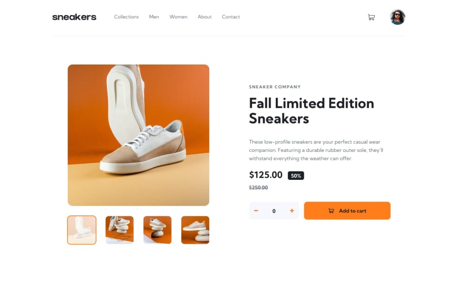
Design comparison
Solution retrospective
This is one of the most excitingly challenging projects i have had to do here on frontend mentor . Any feedback and review would be highly welcomed and appreciated.
Community feedback
- @AdrianoEscarabotePosted about 2 years ago
Hi NKWETAKEM TABO BRUNO, how are you? I really liked the result of your project, but I have some tips that I think you will enjoy:
Images must have alt text unless it is a decorative image, for any decorative image each IMG tag must have empty
alt=""and addaria-hidden="true"attributes to make all the assistive technologies of the Web, as screen reader. Learn the differences between decorative/meaningless images vs important content.I noticed that in higher resolutions the content is stretching a lot, to fix this we can do the following:
body {
    max-width: 1440px;
    margin: 0 auto;
}
The rest is great!
I hope it helps... 👍
0
Please log in to post a comment
Log in with GitHubJoin our Discord community
Join thousands of Frontend Mentor community members taking the challenges, sharing resources, helping each other, and chatting about all things front-end!
Join our Discord
