Design comparison
SolutionDesign
Community feedback
- @RaidEyesPosted 11 months ago
Great work! It was a tough challenge for all of us too. Overall, you got the basic ideas of this challenge. However, I found a few bug that may need your consideration:
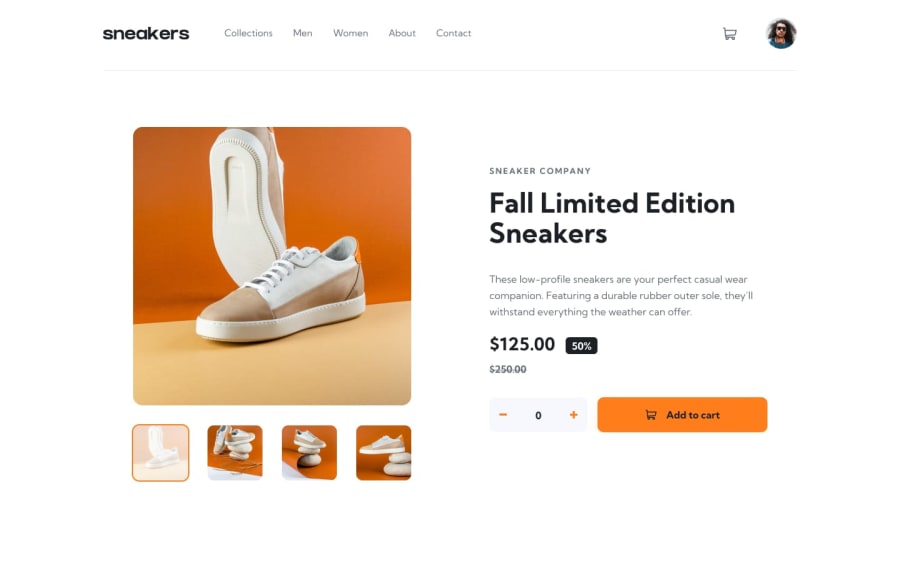
- The cart element doesn't show when I click to check how many products in my cart.
- The carousel works but when I click on the photo, it should show a carousel with a dark background behind. Consider using
<dialog>combine withshowModal()to achieve this behavior. - The layout is not normal between the mobile and desktop version, specifically the tablet version needs more attention. I understand that you don't have the tablet design, but it's okay, you can create your own version for it, just like I did.
Happy coding! I hope this help you!
0@bharathkumar369Posted 11 months ago@RaidEyes thank you for your input... I didn't give time for the tablet version as you said.... I'll keep this in mind for my future projects... I was in a hurry to publish this as I've kept a timeline to upload and I'll be very careful in the future...
much appreciated for the suggestions
0
Please log in to post a comment
Log in with GitHubJoin our Discord community
Join thousands of Frontend Mentor community members taking the challenges, sharing resources, helping each other, and chatting about all things front-end!
Join our Discord
