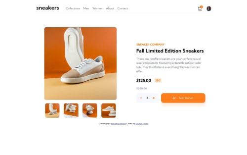
Submitted about 2 years agoA solution to the E-commerce product page challenge
Responsive ecommerce website using mobile first
accessibility
@byNico1

Solution retrospective
I am practicing my frontend skills I would like feedback on:
how can I improve my javascript code? because I think it could be improved but without a framework just vanilla JS as I did it
Code
Loading...
Please log in to post a comment
Log in with GitHubCommunity feedback
No feedback yet. Be the first to give feedback on Nicolas's solution.
Join our Discord community
Join thousands of Frontend Mentor community members taking the challenges, sharing resources, helping each other, and chatting about all things front-end!
Join our Discord