Submitted almost 2 years ago
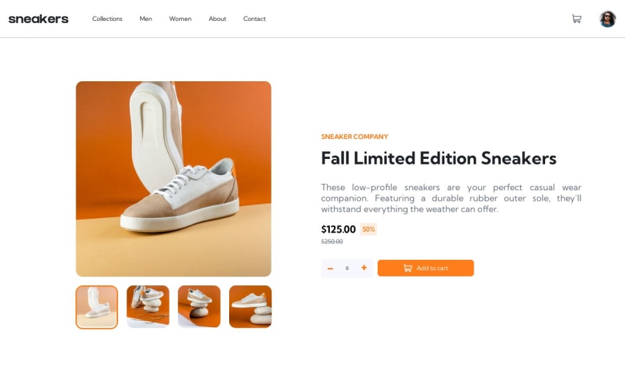
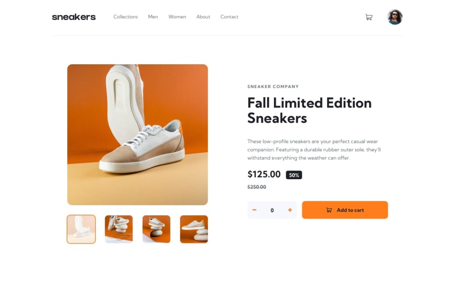
Responsive E-commerce website using CSS Grid, Flexbox and JavaScript
@Olatoyan
Design comparison
SolutionDesign
Community feedback
- @Bader-IdrisPosted almost 2 years ago
You can put all elements inside a container, to set the paragraph a specific, and by using
display: flexyou can easily change between phone and PC media queries, nevertheless, the function of clicking on the image slider, doesn't work on PC, and phone needs to change main images container's width, paragraphs needs to be bolder and a little bigger than what they are. Achieving this phase is great, I salute you for that🎉🎊0
Please log in to post a comment
Log in with GitHubJoin our Discord community
Join thousands of Frontend Mentor community members taking the challenges, sharing resources, helping each other, and chatting about all things front-end!
Join our Discord
