Design comparison
SolutionDesign
Solution retrospective
This was relatively difficult.
Any feedback on improvement would be helpful
Community feedback
- @clarencejuluPosted about 2 years ago
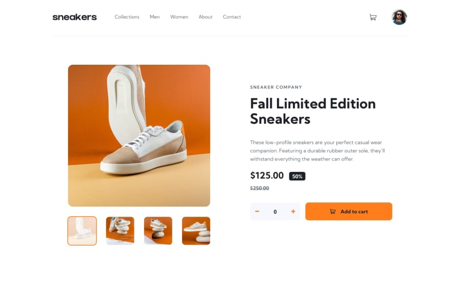
Whats up Favour?, This is a very good project man. I really like the transition/animation you added to the cart and the functionality for changing the number of items in the cart after adding them.
The only minor issues are with the mobile responsiveness.
- Firstly, for the heading you should allow it extend across the whole screen by putting it in a flexbox and setting the width to 100% of the screen.
- Finally, the images on smaller screens could look much better if you set the width also to 100% and then the background size to either 'cover' or a percentage suitable to allow a very good amount of the image's detail (shoes) to show properly.
Marked as helpful1
Please log in to post a comment
Log in with GitHubJoin our Discord community
Join thousands of Frontend Mentor community members taking the challenges, sharing resources, helping each other, and chatting about all things front-end!
Join our Discord
