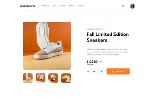
Responsive E-commerce Using SASS

Solution retrospective
Building this project was an exciting yet challenging journey. While I embraced the learning curve, the intricacies of HTML posed some initial difficulties. Wrestling with the structure and ensuring proper semantics took some time, but I found valuable guidance in online tutorials to navigate through these hurdles. Additionally, integrating Sass for enhanced styling brought its own set of challenges, as I ventured into a more sophisticated approach to managing my stylesheets.
As I reflect on the code, there are specific areas that leave me with a tinge of uncertainty. The responsiveness of certain elements, especially when it comes to different screen sizes, is an aspect I'm keen on refining further. Ensuring a seamless user experience across various devices remains a puzzle I'm eager to solve. Additionally, while my understanding of Sass has grown, I'm still navigating the intricacies of its advanced features, such as mixins and functions, hoping to polish these aspects for a more efficient and maintainable codebase.
Please log in to post a comment
Log in with GitHubCommunity feedback
No feedback yet. Be the first to give feedback on Tomas Box's solution.
Join our Discord community
Join thousands of Frontend Mentor community members taking the challenges, sharing resources, helping each other, and chatting about all things front-end!
Join our Discord