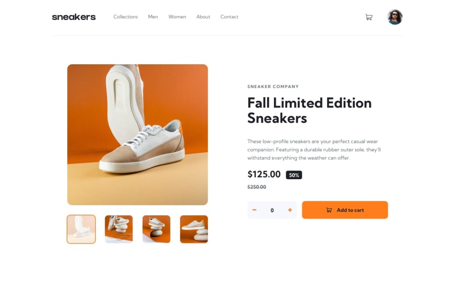
Design comparison
Solution retrospective
I am most proud of my curiosity which led me to go beyond the project's requirements. This allowed me to create extra pages for each product model, add a sorting feature, and develop home, men, women, about, and contact pages.
Next time, there are a few things I would do differently:
-
Better Planning: I would spend more time planning the project and creating detailed sketches of the pages. This would make the development process smoother and reduce the need for big changes later on.
-
User Testing: I would do more user testing throughout the project. Getting feedback early would help me find and fix issues quickly and make sure the final product meets users' needs.
-
Code Optimization: I would focus on writing cleaner and more efficient code. Regularly improving and optimizing my code would make it run better and be easier to maintain.
By focusing on these areas, I aim to improve my process and deliver even better results in future projects.
What challenges did you encounter, and how did you overcome them?For this project, I set the goal of using only vanilla JavaScript, which presented several challenges:
-
Integrating Features: One major challenge was ensuring all the features worked seamlessly together. To overcome this, I debugged each component, focusing on how they interacted. By breaking down the project into smaller tasks and tackling them individually, I successfully integrated all features.
-
Designing the Layout: Designing the layout for various pages was another challenge. To address this, I researched several e-commerce websites to gather inspiration and best practices. This research helped me create a functional and visually appealing design, and also provided new ideas for future projects.
-
Implementing Cart Functionality: Developing the cart functionality required precise handling of JavaScript events and state management. I tackled this by breaking down the cart operations (adding, removing, and updating items) into smaller functions, ensuring each part worked correctly before integrating them.
-
Adding Sorting Features: Implementing the sorting feature for the men's and women's pages involved manipulating the DOM and handling user inputs. By focusing on user experience, I ensured the sorting was intuitive and responsive.
By addressing these challenges and learning from each step, I completed the project successfully and gained valuable insights for future development work.
What specific areas of your project would you like help with?I would appreciate any feedback on my project. Learning from feedback is incredibly valuable to me, as it helps me understand what I did well and where I can improve. Your insights can guide me in refining my skills and making my future projects even better.
Community feedback
- @DaniNewAccPosted 6 months ago
Hi, you have done a very cool project, one thing that can be done on the single product page is implementing the closing of the lightbox when the user click outside of it.. Other than that
cursor: pointerwhen hovering on images and something that tells the user which image is selected like a different border color can give more user friendly design to the page.Marked as helpful0@DoileoPosted 6 months ago@DaniNewAcc, thank you so much for your positive feedback and for appreciating the project! Your suggestions are precious and insightful. I'll work on incorporating these improvements to make the product page even more user-friendly. Thanks again for your constructive input!
0
Please log in to post a comment
Log in with GitHubJoin our Discord community
Join thousands of Frontend Mentor community members taking the challenges, sharing resources, helping each other, and chatting about all things front-end!
Join our Discord
