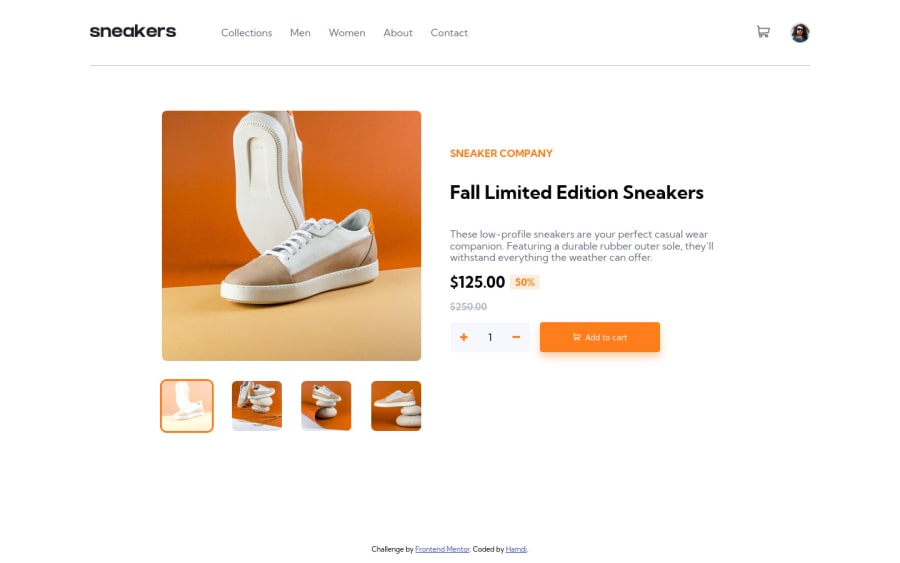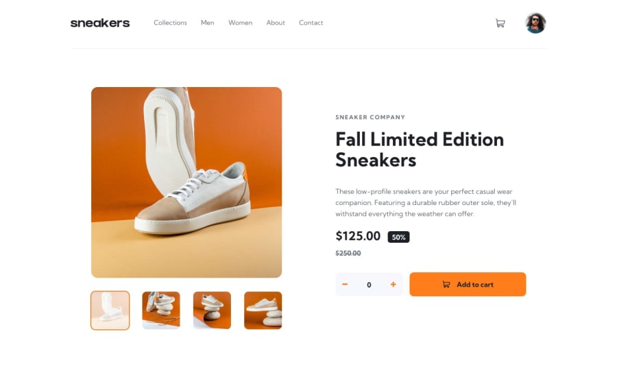
Responsive e-commerce product page with CSS flexbox and React
Design comparison
Solution retrospective
Hello, community :)
I only used React and vanilla HTML/CSS for this project, Everything is functioning correctly same as on the project challenge page
Things I found a bit tedious:
- I had to write a lot of CSS classes and the naming process was pretty random and untidy
- Since the CSS code was getting big working with it was tedious, Maybe I should use CSS modules or similar techniques?
I would appreciate feedback on what good practices I need to apply to make things better, I'm kind of obsessed with writing clean and organized code so I'm surely going to rewrite this with better technique in the future, Thanks for reading :)
Community feedback
- @JustinFowlerArtPosted about 2 years ago
I definitely understand the large quantity of CSS classes and issues with naming conventions. Although I used Material UI for this project, another project here I focused on learning SASS and the BEM naming convention. Both of these significantly reduced the redundancy and improved the readability of the stylesheets.
CSS preprocessors could be a good potential solution for writing and managing the CSS, and BEM pairs well for making simple, easy to understand class names.
Although not strictly necessary for this challenge, you might increase the resolution of the breakpoint where you switch from mobile to desktop styles. It gets squashed in the larger phone/tablet area. Maybe increasing to around 768px before switching to desktop styles.
Finally, I noticed the thumbnail images are horizontal rectangles on desktop, and vertical rectangles on mobile instead of square. Everything else looks great and functions smoothly. Great job!
Marked as helpful1@justgo97Posted about 2 years agoHi @JustinFowlerArt Thanks for your feedback! I have switched to using SASS and now classes are nested in each other which seems a lot tidier I guess, I didn't start using BEM yet but that might be my next step.
I also changed the resolution of the breakpoint to 768px and made the thumbnail image a fixed size, now they should be a square all the time.
1
Please log in to post a comment
Log in with GitHubJoin our Discord community
Join thousands of Frontend Mentor community members taking the challenges, sharing resources, helping each other, and chatting about all things front-end!
Join our Discord
