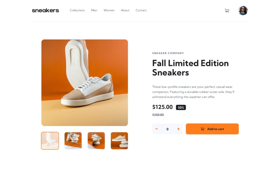
Responsive E-commerce Product Page using Tailwind and React JS
Design comparison
Community feedback
- @maicondguerianPosted about 1 year ago
"Hey Faizal, before I provide my feedback, are you Brazilian? By the way, you did a pretty good job on this project with Tailwind and React. The final outcome was quite close to the challenge's requirements. However, from my understanding, React is about creating small, reusable components by breaking down the responsibilities into smaller, more organized components., that when togheter, make your application.
To make it even better, here are a few things you can improve:
-
Create a context to pass props through it. Prop drilling isn't always recommended, and using context will certainly make your code easier to maintain and understand.
-
Create more components for various parts of your application, such as Header, Cart, ProductGallery, Description, or BuytSide.
-
I noticed you used an alert to display a success message when a product is added to the cart. There's a library called React-toastify designed for this purpose; it would be cooler to use it instead of an alert.
-
When you add a product to the cart, the counter should reset to zero, creating a more immersive experience.
-
Currently, you are replacing the quantity of the product with the new quantity, rather than adding the old quantity to the new one.
-
The last thing is that you are reusing the modal component for mobile resolution. While this is a nice solution, you can make it a modal with a display:block instead and remove the overlay to make it blend in with the rest of the content. But once again, I liked your solution!"
Marked as helpful0@faizal789Posted about 1 year agohello @maicondguerian Thank you nice feedback I'm from Indonesia
1 -
Please log in to post a comment
Log in with GitHubJoin our Discord community
Join thousands of Frontend Mentor community members taking the challenges, sharing resources, helping each other, and chatting about all things front-end!
Join our Discord