Submitted over 2 years ago
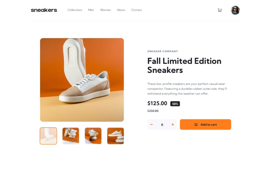
Responsive ecommerce product page using Reactjs, and Css Flexbox
@BasharKhdr1992
Design comparison
SolutionDesign
Solution retrospective
Your feedback is highly appreciated.
Community feedback
- @tomhinePosted over 2 years ago
Hey Bashar, great job with this challenge it looks really good! There are a couple of design things that could be improved though;
- I think everything looks quite big, definitely bigger than the reference maybe try adding a
max-widthto the main container? - The links and the avatar image both shift on hover because you're adding the border when the elements are being hovered. You could try adding the border to the element permanently but make it transparent, then just change the colour on hover.
- Your plus and minus buttons on the cart are the wrong way round.
Again, really good job with this and I hope this helps.
Marked as helpful0@BasharKhdr1992Posted over 2 years ago@tomhine I will definitely go over my design again based on your notes and fix it. Thanks for stepping by.
1 - I think everything looks quite big, definitely bigger than the reference maybe try adding a
Please log in to post a comment
Log in with GitHubJoin our Discord community
Join thousands of Frontend Mentor community members taking the challenges, sharing resources, helping each other, and chatting about all things front-end!
Join our Discord
