Design comparison
SolutionDesign
Solution retrospective
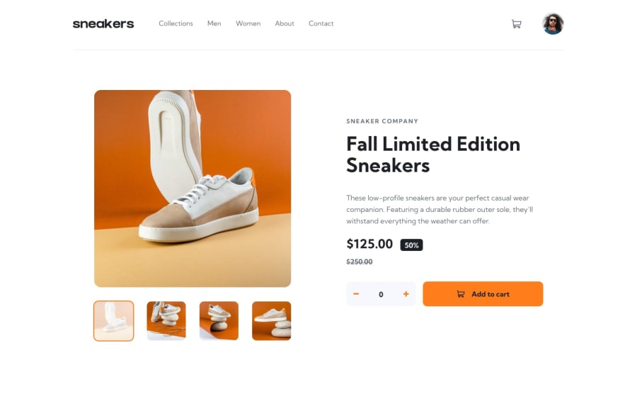
I should've use a grid instead of flex. flex made difficult for me to make this layout responsive. There are few things which I was not able to figure it out. The first is how can I change opacity of thumbnails without affecting on border and without adding extra div outside of thumbnails. and I am not sure how can I make that lightbox. Help me to improve my solutions. Any feedback will be appreciated.
Community feedback
Please log in to post a comment
Log in with GitHubJoin our Discord community
Join thousands of Frontend Mentor community members taking the challenges, sharing resources, helping each other, and chatting about all things front-end!
Join our Discord
