Submitted almost 3 years ago
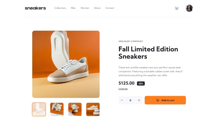
Responsive Ecommerce Product Page
@Priambodo-Kurniawan
Design comparison
SolutionDesign
Solution retrospective
Any feedback is welcomed and appreciated! :)
Community feedback
- @EmmanuelHexerPosted almost 3 years ago
Great job man. Keep it up
0 - @MemeenaPosted almost 3 years ago
Hi.. Your solution looks great! Your success message after updating cart is so good. One thing I noticed is when changing to mobile version, the notification is a bit misplaced. Overall great solution!
0@Priambodo-KurniawanPosted almost 3 years ago@Memeena yaap, wow, thank you for being detail hehe. I will fix it! 🍻
0 - Account deleted
Hello there! 👋
Congratulations on finishing your challenge! 🎉
I have some feedback on this solution:
- Always Use Semantic HTML instead of
divlike<main><header>, etc for more info.
if my solution has helped you do not forget to mark this as helpful!
0@Priambodo-KurniawanPosted almost 3 years ago@Old1337 Yes, thank you for your feedback! 😄 trying to be more semantic for the next! 🍻
1 - Always Use Semantic HTML instead of
Please log in to post a comment
Log in with GitHubJoin our Discord community
Join thousands of Frontend Mentor community members taking the challenges, sharing resources, helping each other, and chatting about all things front-end!
Join our Discord
