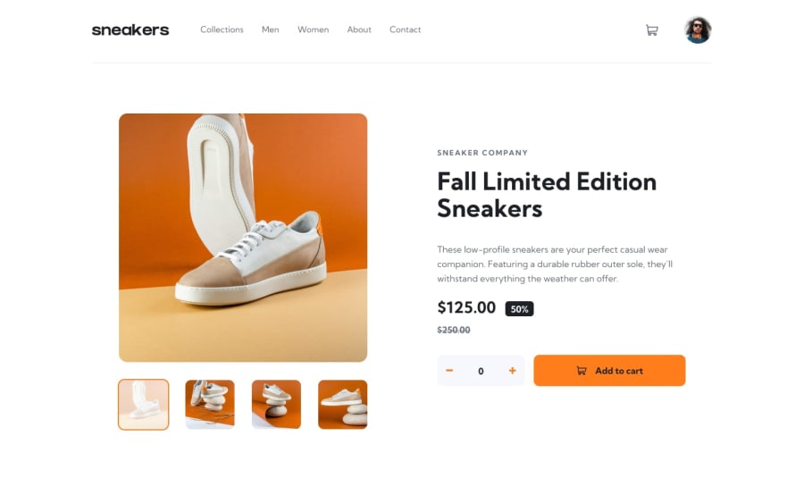
Responsive E-commerce product page built with html, css and JavaScript
Design comparison
Community feedback
- @ShayneJGPosted about 1 year ago
Hey Ahmed :)
Good job on the challenge!
I really love the mouse over effects you have on the desktop menu. The transition looks really good.
Some things to consider:
-
Elements on page are too large on 1440p monitors. Consider adding a max width/height.
-
There is an uncaught TypeError if you click the image in mobile view. You might need to find a way to check whether or not the image is being viewed at a certain screen size.
-
The borders of your thumbnail images are also being affected by the opacity. You can avoid this by putting the image in a <div> and then setting the border on the div instead.
-
The design images suggest that the thumbnails should have some white colour show through on hover and selection. This works because you have a white background on the main page, but in the lightbox view, it shows them as dimmer because of the darker background. Adding a white background to a <div> is a workaround to this.
Keep up the good work :)
Marked as helpful1 -
Please log in to post a comment
Log in with GitHubJoin our Discord community
Join thousands of Frontend Mentor community members taking the challenges, sharing resources, helping each other, and chatting about all things front-end!
Join our Discord
