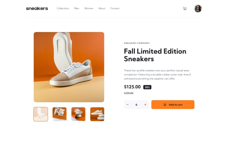
Design comparison
SolutionDesign
Solution retrospective
Hi, ya'll o/ I guess it take so much of my time that ended up let me anxious. So, I decided to give it a FINISHED state and move on to another challenge. Maybe I'll come back later in the future and finish it.
It was an incredible project from the review old CSS concepts perspective, practice a whole hack of a lot.
- Ended up changing the way I build the side menu to something more less error-proned and a bit more accessible(similar to how Kevin Powell teaches).
- Ohh, and that image slider, DUDE that thing make me tought I was a genius. Didn't look to other solutions but it make me feel really well <3 Felling like I was accomplishing something new again, you now ?
I'm publishing this project without finishing that Cart popup w/ it's funcionalities.
GG, ya'll o/
Community feedback
Please log in to post a comment
Log in with GitHubJoin our Discord community
Join thousands of Frontend Mentor community members taking the challenges, sharing resources, helping each other, and chatting about all things front-end!
Join our Discord
