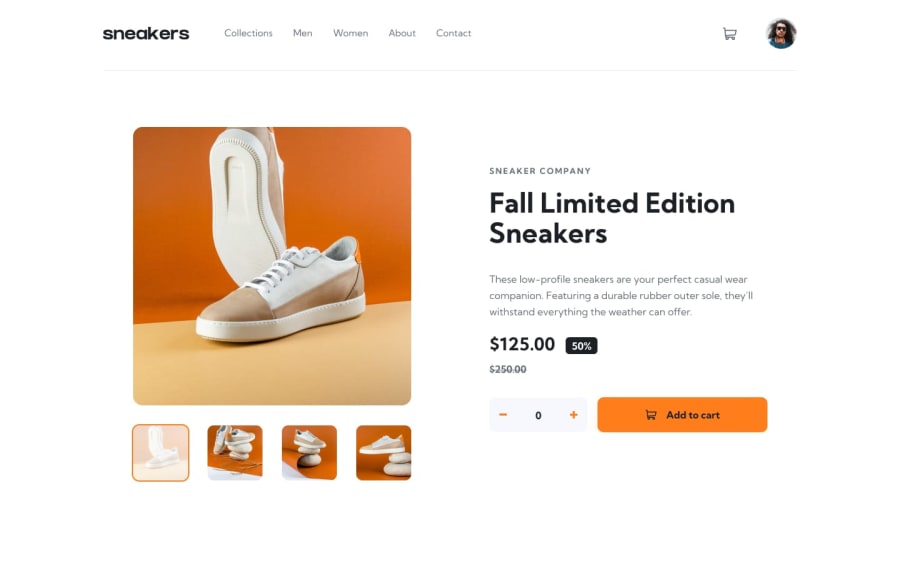
Design comparison
SolutionDesign
Solution retrospective
Any feedback is greatly appreciated!
Community feedback
- @Jank1510Posted almost 2 years ago
Hello, congratulations on finishing the challenge! Some recommendations I would like to give you are to use outline: 2px solid var(--orange); instead of border: 2px solid var(--orange); in .profile-img:hover so that it does not affect the design composition when you add the border. And regarding accessibility errors, I recommend using <div/> instead of <button/>.
Marked as helpful1
Please log in to post a comment
Log in with GitHubJoin our Discord community
Join thousands of Frontend Mentor community members taking the challenges, sharing resources, helping each other, and chatting about all things front-end!
Join our Discord
