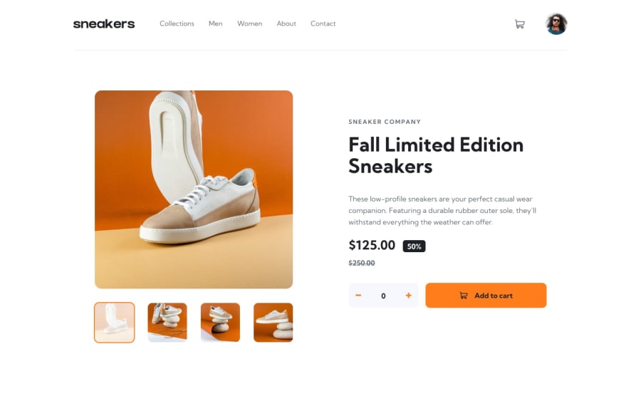
Responsive E-commerce landing page built with vanilla js
Design comparison
Solution retrospective
Tried as much i could on this project. What do you think guys?
Community feedback
- @pikapikamartPosted about 3 years ago
Hey, awesome work on this one. Desktop layout looks really great, site is responsive and the mobile state looks really great as well.
Some suggestions would be:
- It would be great to have this markup as the direct child of the
bodytag:
<header />
<main />
<footer />
This way, all content of your page will be inside their own respective landmark element.
- I also saw the there are separate markup for the mobile state and desktop for the navbar? It would be really great to only use 1 and make it work for mobile and desktop. You would just need to adjust those in the
@mediato look like mobile or desktop layout. This way, you won't need to create extra html element. - Include the website-logo inside the
navsince you are treating it as a link that directs user to the homepage. - Also, you don't need
h1to wrap the website-logo, adivwould be fine. - Website-logo-link
atag should have eitheraria-labelattribute orsr-onlytext inside, that describes where the link would take the user. Usually, website-logo directs user to homepage so usehomepageas the value like `aria-label="homepage". - Remember that a website-logo is one of the meaningful images on a site so use proper
altfor it. Use the website's name as the value likealt="sneakers". - When using
imgtag, you don't need to add words that relates to "graphic" such as "logo" and others, sinceimgis already an image so no need to describe it as one. - The cart should have use the same method , the
aria-labelorsr-onlytext. This time, describe what thebuttonshould do. It could bearia-label="shopping cart dropdown". - The
svginside the cart is only decorative image, so hide for screen-reader users usingaria-hidden="true". - The cart-button should also have a default of
aria-expanded="false"attribute. This will be set totrueif the user toggles it and vice-versa. - Also the cart-dropdown should be next to the
buttonon the markup. Right now, it is placed way beyond the cart-button, hence when you , for example toggles the cart using keyboard, usingtabagain does not direct to the cart-dropdown, it instead goes to the person profile because the markup placement is wrong. - The sneaker-image should not be a link
asince it does not directs a user to another page. Instead, usebuttonon it with a properaria-labelorsr-onlytext on what thebuttondoes. - I also usage of
!importantin the css, we normally avoid this because it makes it hard to overwrite properties. - Also, on the image again of the sneaker, use only 1
buttonfor it. Then just change theimginside it or change itsbackground-image. Do not use multiple trigger elements on it. - Those 4 selections of image should be using like
buttonor a set of radio-buttons. Remember that interactive components needs to use interactive elements. Usingdivorimgas a toggle makes the component not accessible. - When wrapping up a text-content, make sure that it is inside a meaningful element like
ptag or heading tag and not using likediv, spanto wrap the text. - Avoid using
idto target and style an element since it is a bad practice due to css specificity. - Same with the minus and add
button, use a labelling method for it. Thesvginside it should be hidden as well, use the method I mentioned above. svginside the add-to-cart should be hidden as well.
Also there's a bug. After pressing the add-to-cart. I can't pressed it again but when using the plus on the
buttonit adds another item on the cart which should not be. Only when pressing add-to-cart should add an item right. You don't want user to be surprised why are there lots of order that they didn't "add to cart".- The cart delete-item
buttonshould also use labelling. - For this one, I would add element/elements that uses
aria-liveto announce that something has been made. You can look up foraria-liveto know what I mean:>
MOBILE
- Hamburger
buttonshould also use labelling. It should use likenavigation dropdown menu. - Hamburger
buttonshould have a default as well ofaria-expanded="false"which is set to true if it has been toggled. - The
imginside the hamburger-menu should have been hidden since it is only a decorative image. - Again, the placement for the hamburger-menu and the dropdown is incorrect. The dropdown should be placed after the hamburger menu.
If you have any queries, just let me know okay. Aside from those, great job again on this one.
Marked as helpful1@SamsegunPosted about 3 years ago@pikamart wow... thanks pal. This is really helpful!
1 - It would be great to have this markup as the direct child of the
Please log in to post a comment
Log in with GitHubJoin our Discord community
Join thousands of Frontend Mentor community members taking the challenges, sharing resources, helping each other, and chatting about all things front-end!
Join our Discord
