Submitted 9 months ago
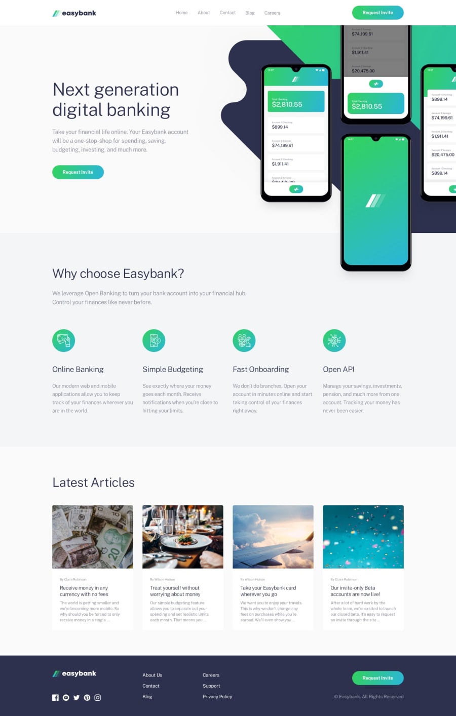
Responsive Easy-Banking page using SCSS, CSS (grid, flex box) and JS.
@JusticeJatau
Design comparison
SolutionDesign
Solution retrospective
What i found difficult in this project are:
- positioning of the mockup and intro image
- Trying to make it responsive even though i didn't do a good job with that
- figuring out which approach to use for properly aligning contents in the page.
Areas that i am unsure of are:
- The part where i make it responsive, while scaling it in the browser, it distort totally and content goes out of place
- positioning of the mockup and intro images
- Alignment of contents in the page
Questions about best practices:
- what are the best practices for structuring contents in your page (HTML) before applying styles to them?
- Is there is a better solution to making content responsive even while scaling the browser?
Community feedback
Please log in to post a comment
Log in with GitHubJoin our Discord community
Join thousands of Frontend Mentor community members taking the challenges, sharing resources, helping each other, and chatting about all things front-end!
Join our Discord
