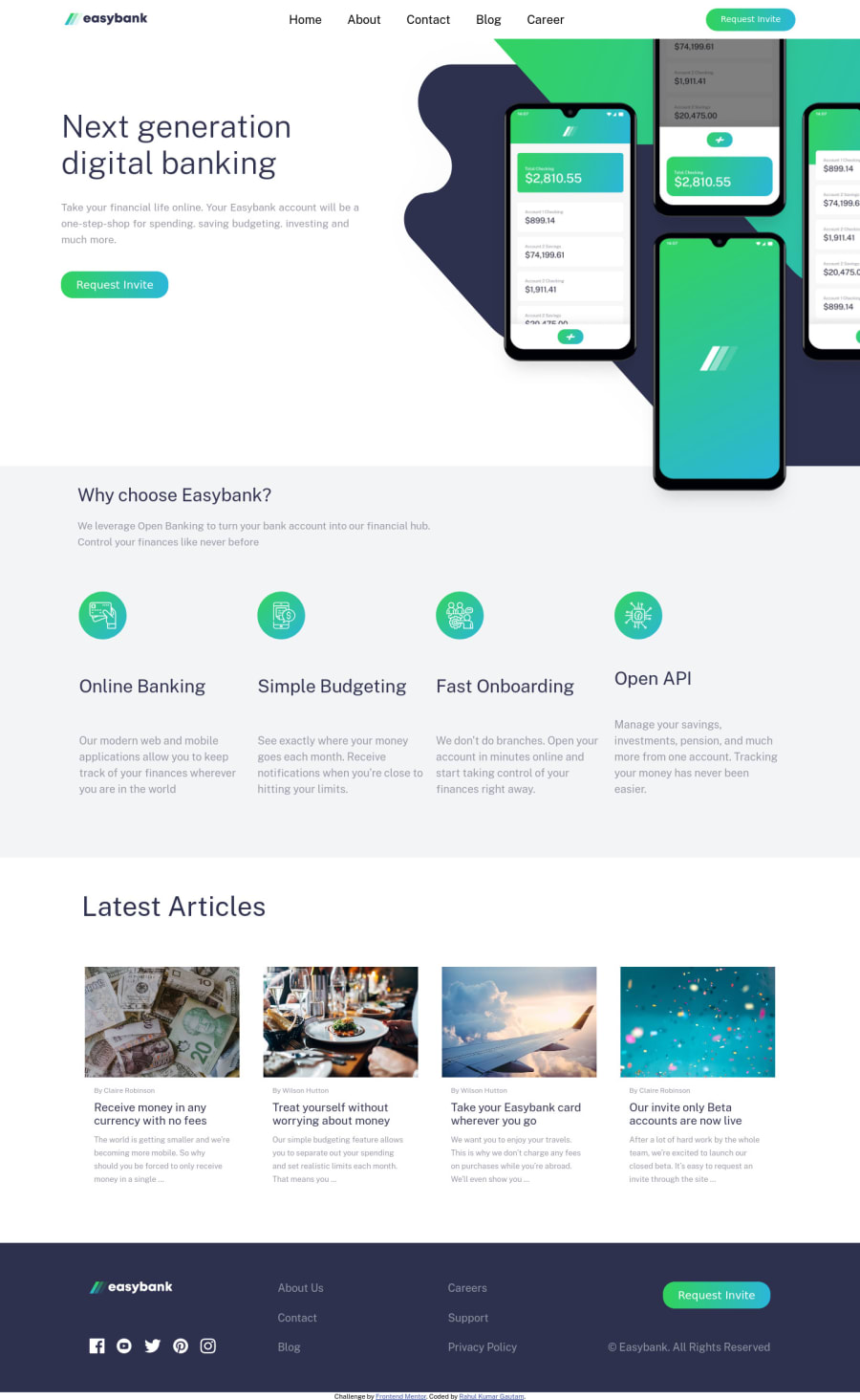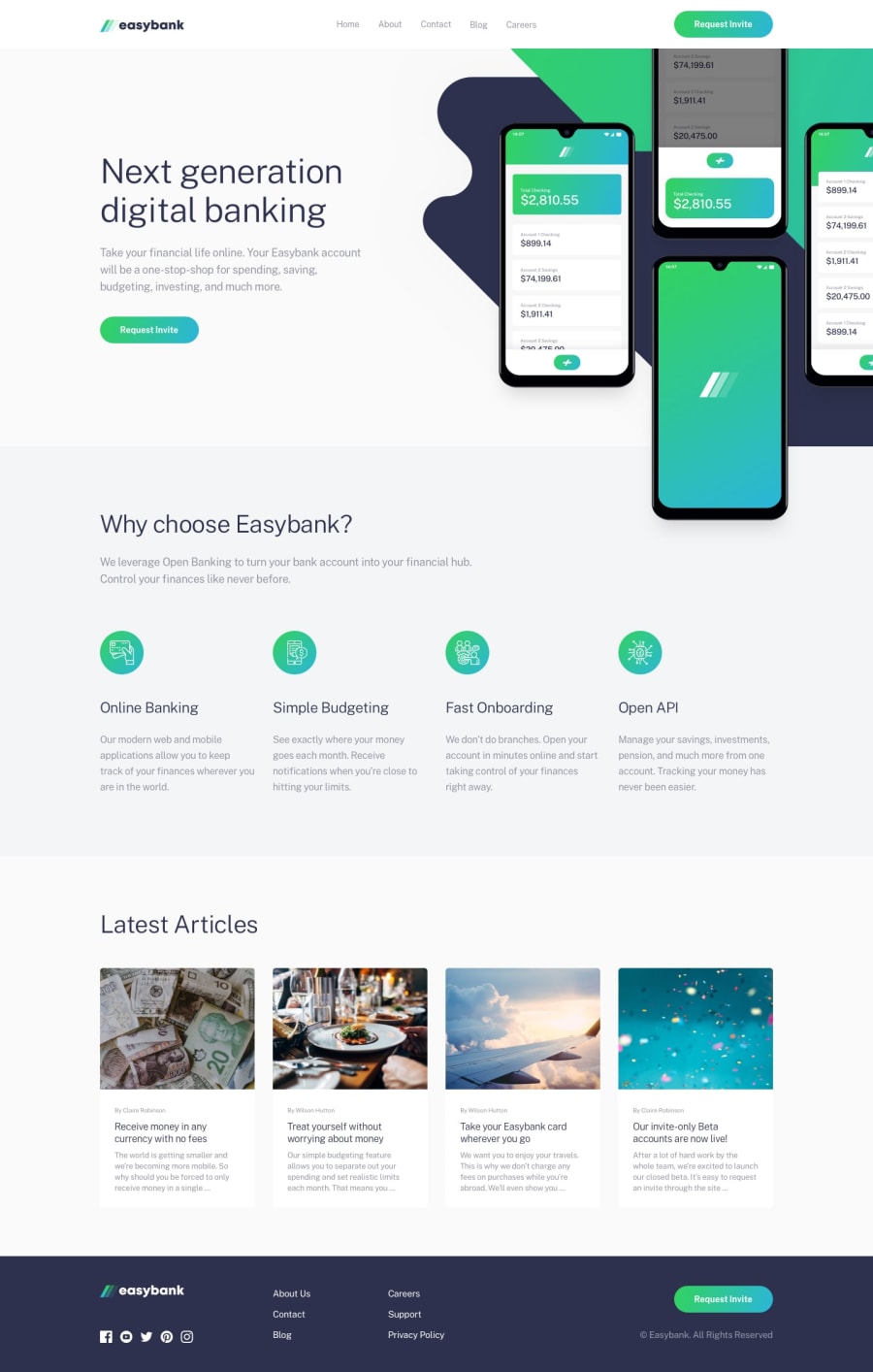
Responsive Easybank page made with CSS flex.
Design comparison
Solution retrospective
feel free to suggest anything...
Community feedback
- @pikapikamartPosted over 3 years ago
Hey, great work. In terms of layout, spot on and good work on that one.
In terms of structure, there are lots to be refactored. Those will be
-
Navbar links. As I inspected your element, you use
ptag in the navlinks which is not appropriate. You must useatag in this because those are links and they need to be inside an anchor tag. The brand logo as well should be nested inside of anatag. Also the font-sizes of the navbar links. -
Buttons. Those supposed button looking things should be an
atag as well. Because they serve as a link to something right andbuttonitself is not okay to use in this one. Changing them toatags will be good, making your markup better. -
Footer links. Those links inside the footer needs to be nested as well in their respective
atags. The social media links and the text links should be. The button should be anatag as well.
Mobile view is good. Overall, your layout is good in terms of UI but making the html structure meaningful is an important part of a good website^
1 -
Please log in to post a comment
Log in with GitHubJoin our Discord community
Join thousands of Frontend Mentor community members taking the challenges, sharing resources, helping each other, and chatting about all things front-end!
Join our Discord
