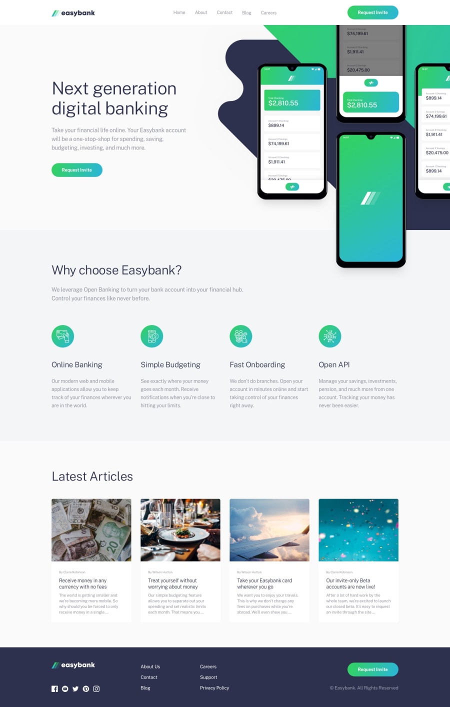
Responsive Easybank Landing Page with pure CSS dan JS
Design comparison
Solution retrospective
My first solution on Intermediate level
Community feedback
- @FluffyKasPosted about 3 years ago
Hey there,
Great work on this challenge it looks pretty close to the original design! The only problem with the layout I found was the "why-cards" section between 770 and 1370px: the alignment of title, text and image is a bit off but probably you just overlooked it, as it seems like an easy to fix issue ^^ I have a few other suggestions as well:
-
Your buttons, footer links and social media links are all missing hover states.
-
For your nav menu and footer menu you're using a
divpopulated with<a>s but I believe a<ul>with<li>s inside (and the<a>tags inside those) would be a better choice. Similar goes to the social media section, instead of adivfull of images, it would be nicer to use a<ul>and wrap your images in<a>tags too, as they're supposed to be clickable. As they don't have any text description, you'll need some aria-labels for them, too. -
I haven't done this challenge but I imagine the articles should be clickable too, they could be wrapped in
<a>s pointing to the relevant articles (or at least the article's title could be!). You're using<h1>s in that section as well. For the document layout, it would make more sense to have only one<h1>for the whole page. The author of the article probably shouldn't be a heading anyway but if you want to keep it like that, you could choose a lower level heading for them. :) -
Your alt texts are a bit all over the place, especially in the article section (there's a repeating restaurant-view alt and one of them is actually missing its alt). You could leave them empty or give them all an alt text but whatever you choose should be consistent :)
-
Your nav menu items are jumping around on hover. This is because their height is changing with the underline. The easiest way to solve this issue would be to use a ::before/::after instead of a border. Or perhaps giving them the same border by default (when they're not hovered), just a transparent one? I haven't tried the latter, but it may work.
But again, really good job on this, I'm sure it took a lot of time and effort! And good luck with improving on it :)
1@eklemisPosted about 3 years ago@FluffyKas Wow.. Seems like i'm at bit in hurry that i didn't put attention on such detail. I feel so great for your detail feedback. I really need this kind of feedback. It helps me get use to important things in front end works I didn't notice because of less experience on this field. I hope you will keep give feedback on my next solutions and all their improvement.
Regards,
0 -
Please log in to post a comment
Log in with GitHubJoin our Discord community
Join thousands of Frontend Mentor community members taking the challenges, sharing resources, helping each other, and chatting about all things front-end!
Join our Discord
