Submitted about 2 years ago
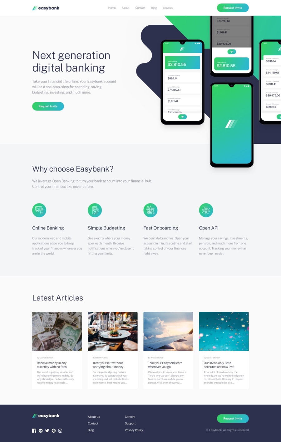
Responsive easybank landing page w/ styled components
@BasharKhdr1992
Design comparison
SolutionDesign
Solution retrospective
Your feedback is highly appreciated. I really had a hard time laying the intro background, and the mockups image on top of each other. I used ::after pseudo element to achieve that. I used rem unit to ensure some sort of consistency across multiple screens. I know my solution is not optimal, so I am always opening for all suggestions.
Community feedback
Please log in to post a comment
Log in with GitHubJoin our Discord community
Join thousands of Frontend Mentor community members taking the challenges, sharing resources, helping each other, and chatting about all things front-end!
Join our Discord
