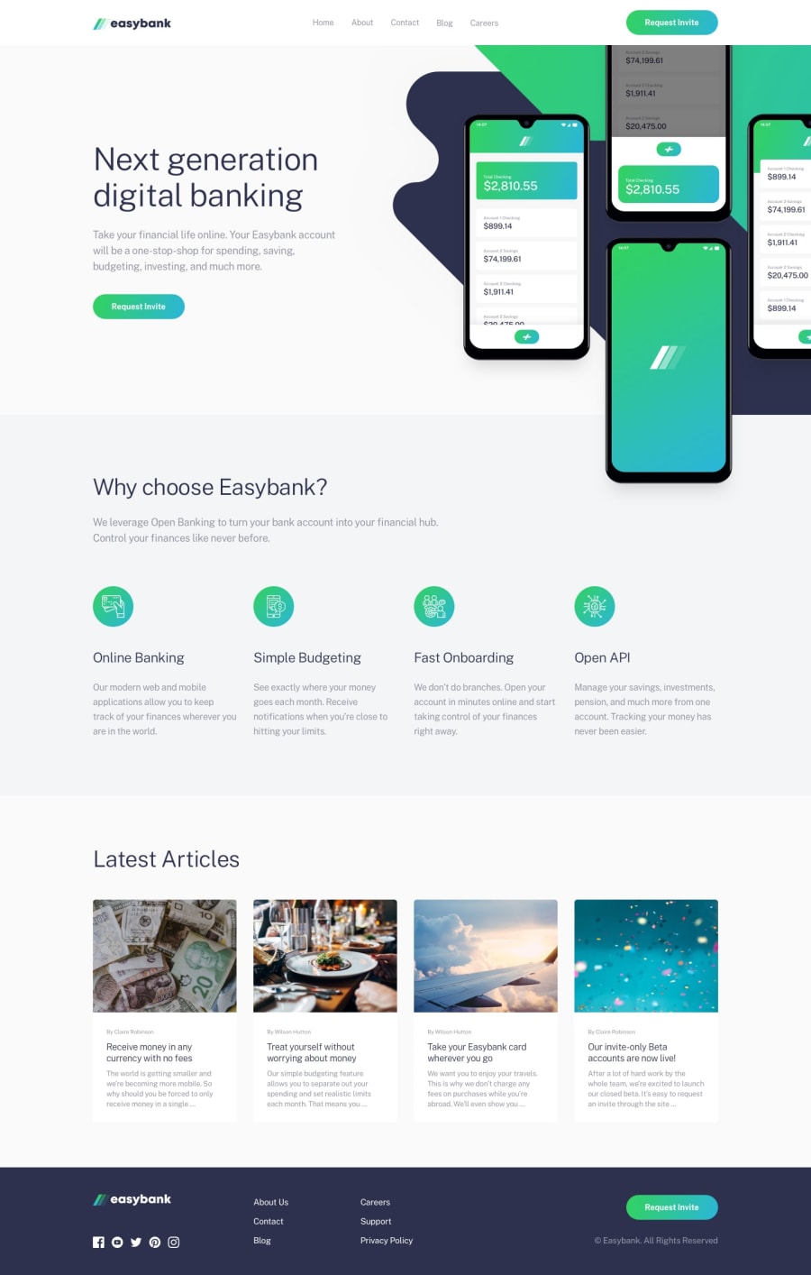
Responsive Easybank Landing Page using HTML, Sass, and JS
Design comparison
Solution retrospective
Feedback is appreciated :)
Community feedback
- @pikapikamartPosted over 3 years ago
Hey, good work on this one. Layout in desktop is good, though the
background-imageon the right side of hero section is missing. Instead of usingurl(/images/bg-intro-desktop.svg) no-repeatin yourbackgrounddeclaration. Useurl(../images/bg-intro-desktop.svg) no-repeat. I used the../path, using/(root) on github does not work, so you need to specify the relative path without using it.Other suggestions would be:
- On your navbar, the easybank logo could have the
alttext set to "easybank". Since that is the company's logo, better to use it to describe a company logo's text. - On the navbar as well, do not nest
buttoninsideatags, this adds a extra tab using keyboard. Usingatag alone will be better. - Wrapping all the content inside
mainwill make your site more structured. The html will be like
header
main
footer
This will make a screen reader user to navigate more properly.
alttext on the hero image could be empty since it is for decorative purpose only.- The heading tags on the "Why choose easybank" should have
h3instead ofh4. This will clear up some issues. When using heading tags, do not jump with 2 or higher heading levels. Go fromh1toh2toh3noth1toh4 - The elements on the articles section could have been wrapped on their own
articletags since they are articles. - The articles heading should been wrapped inside
atags since they will be treated as go to another page to read articles. It would be like:
<a> <h4 or h5> {title} <h4 or h5> </a>- Footer easybank logo's aria-label could have been the easybank as well.
- The links on the
footershould have been insideatags since they are links. - The social media links as well should have been wrapped by
atags. - The hamburger menu on mobile layout should have used a
buttonelement. This adds more semantic in your structure, since you are only usingimgelement, it can't be navigated properly by keyboard or assistive tech. Along with thearia-expandedattribute.
Aside from those, good work.
Marked as helpful1@JordanMooreePosted over 3 years ago@pikamart Thank you so much for the detailed feedback! I learned so much from it. I took care of some immediate changes like the IMG path for Github and the alt text for the easybank logo.
I copied and pasted your suggestions into my notes so I can follow that for the next project! Thanks again. 👌
1 - On your navbar, the easybank logo could have the
Please log in to post a comment
Log in with GitHubJoin our Discord community
Join thousands of Frontend Mentor community members taking the challenges, sharing resources, helping each other, and chatting about all things front-end!
Join our Discord
