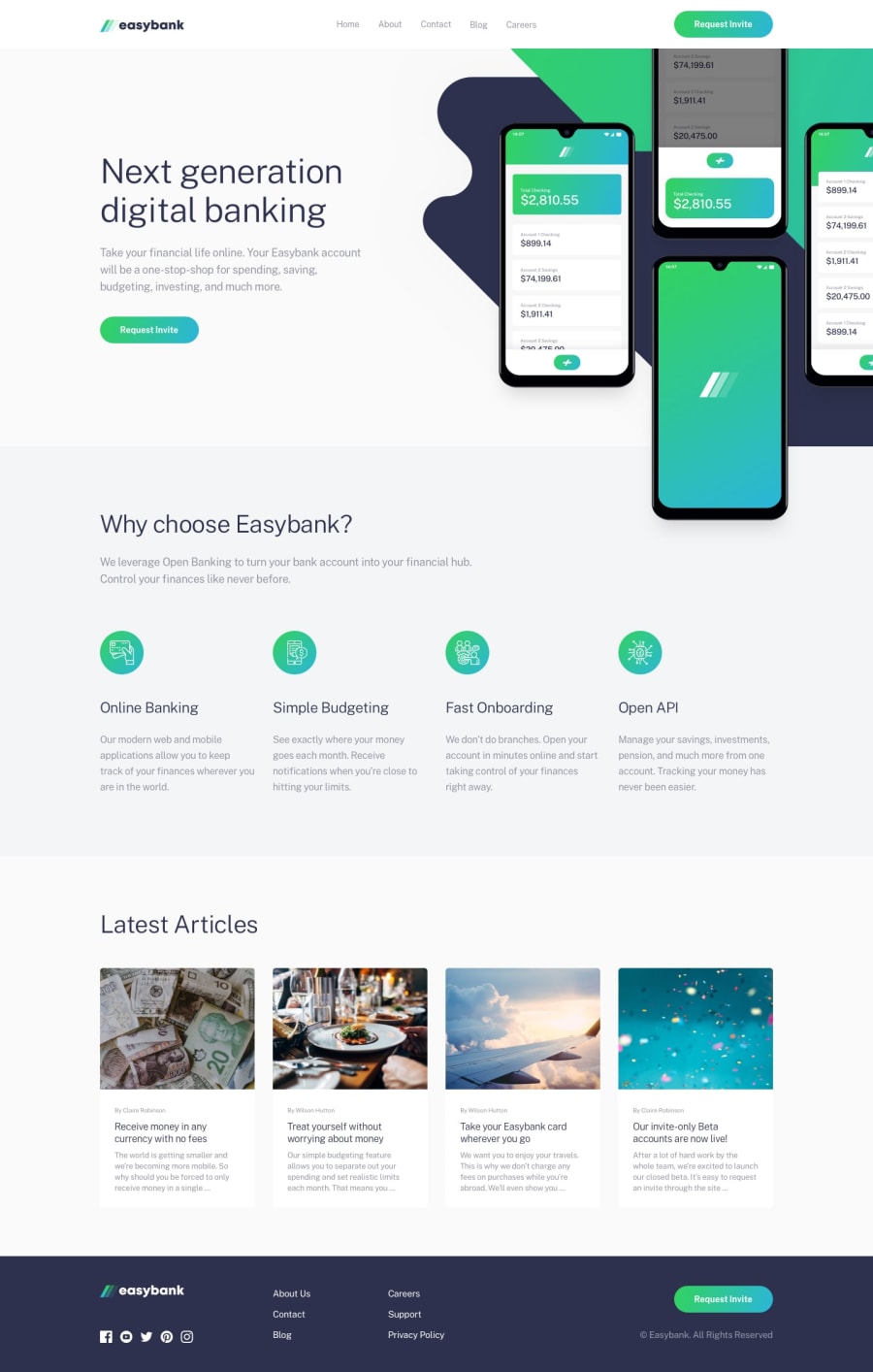
Responsive easybank landing page using flexbox, css grid and sass.
Design comparison
Solution retrospective
Feedback!
Community feedback
- @joelsalmeidaPosted over 3 years ago
Hi Eric. Looks like you had a lot of work on this project. Congratulations. I have some tips to make everything even better.
-
You can use header, nav, main, footer, button... tags instead of just naming classes. You can put all sessions inside a main tag.
-
Don't forget the
alt=" "tags in the images too. -
In the original design the entire page follows a lateral alignment. Check the position of the header in relation to the rest of the body.
-
Check the
font-sizeof your paragraphs. Some are too small. -
Check the title color of articles on hover.
-
When opening the "mobile" hamburger menu the page should not be able to scroll. "I liked the animation, so smooth :)"
Hope this helps. Keep coding.
Marked as helpful3 -
Please log in to post a comment
Log in with GitHubJoin our Discord community
Join thousands of Frontend Mentor community members taking the challenges, sharing resources, helping each other, and chatting about all things front-end!
Join our Discord
